IBM SYSTEMS DESIGN SUMMIT
Creating A cohesive visual identity for a global design experience
Brand Identity, Visual Design, Design Systems, Creative Direction
Project Background
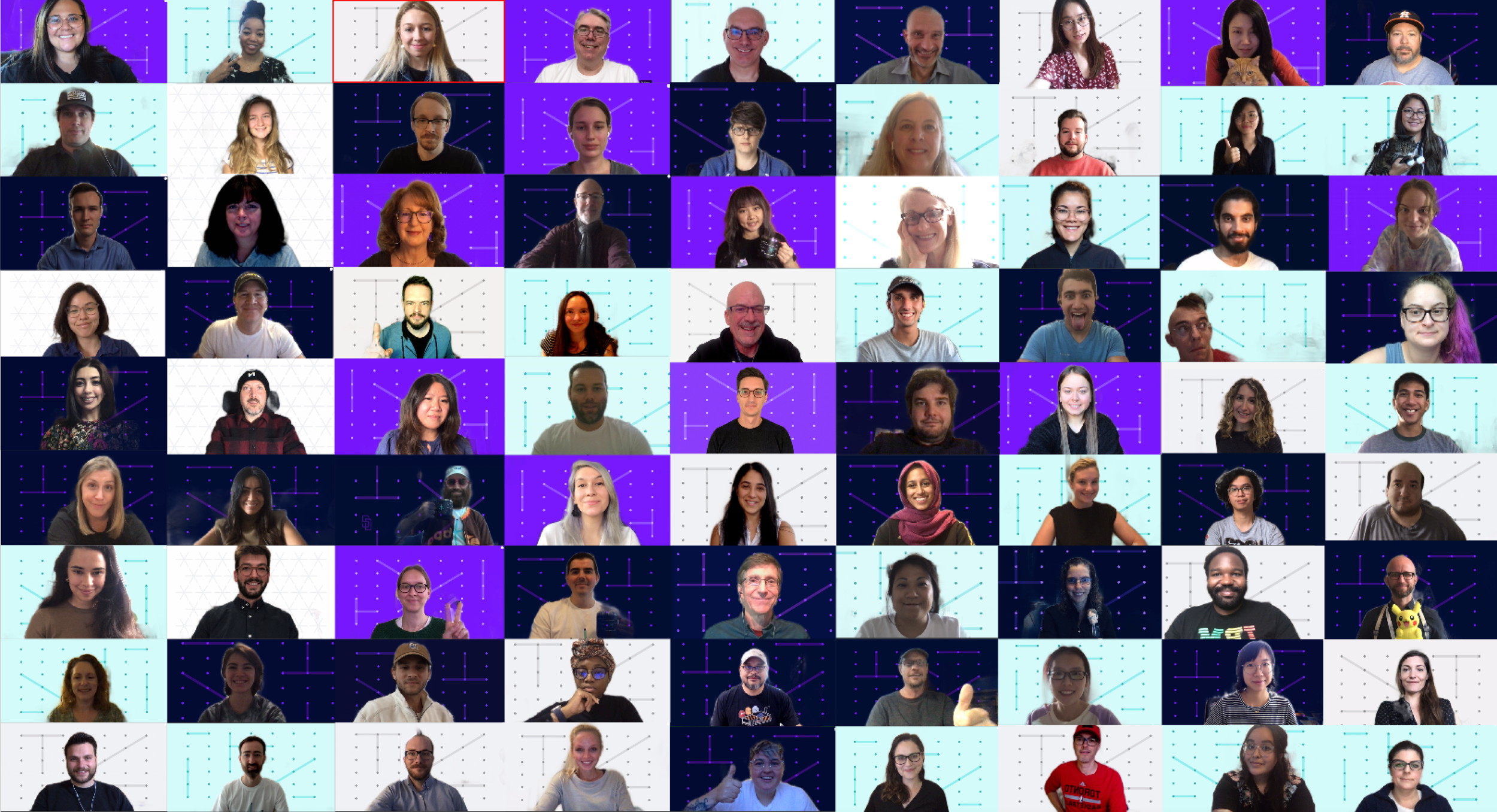
The IBM Systems Design Summit brought together designers across IBM Systems for its first fully virtual design conference. The event created an opportunity to connect teams, share knowledge, and strengthen the broader design community. As a member of the core planning team and lead of the branding committee, I helped develop a distinctive visual identity that captured the spirit of connection and collaboration. The challenge was to create a flexible, recognizable design language that could extend seamlessly across the conference’s digital experiences, communications, and physical materials.
The Approach
Our approach centered on three key phases: defining the brand, developing a scalable visual language, and establishing guidelines for consistent execution. Through collaborative exploration and iterative design, we translated the conference’s purpose into a cohesive identity that could adapt to multiple formats while maintaining a unified experience.
01- Defining The Brand
Turning a shared purpose into a visual direction
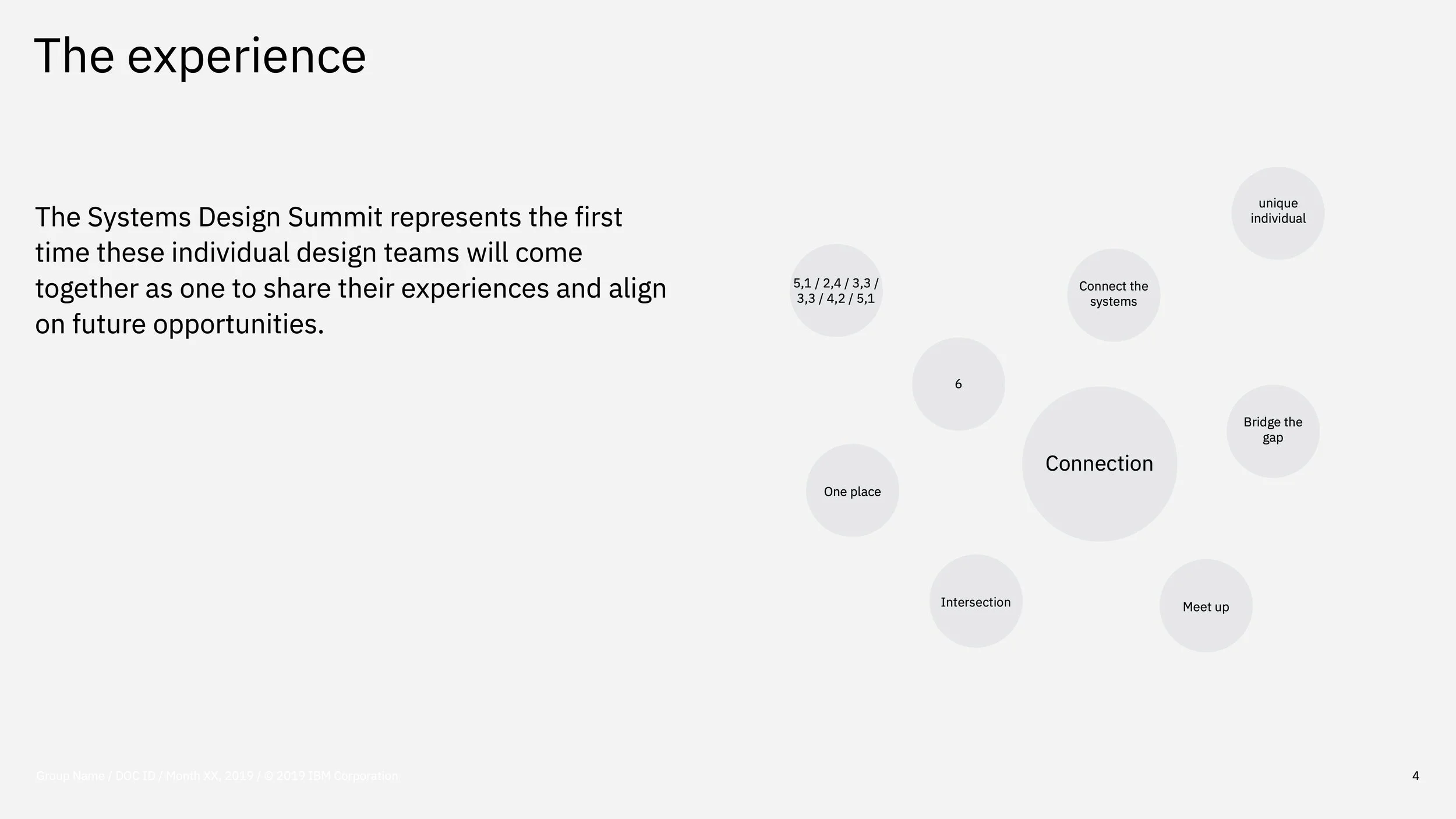
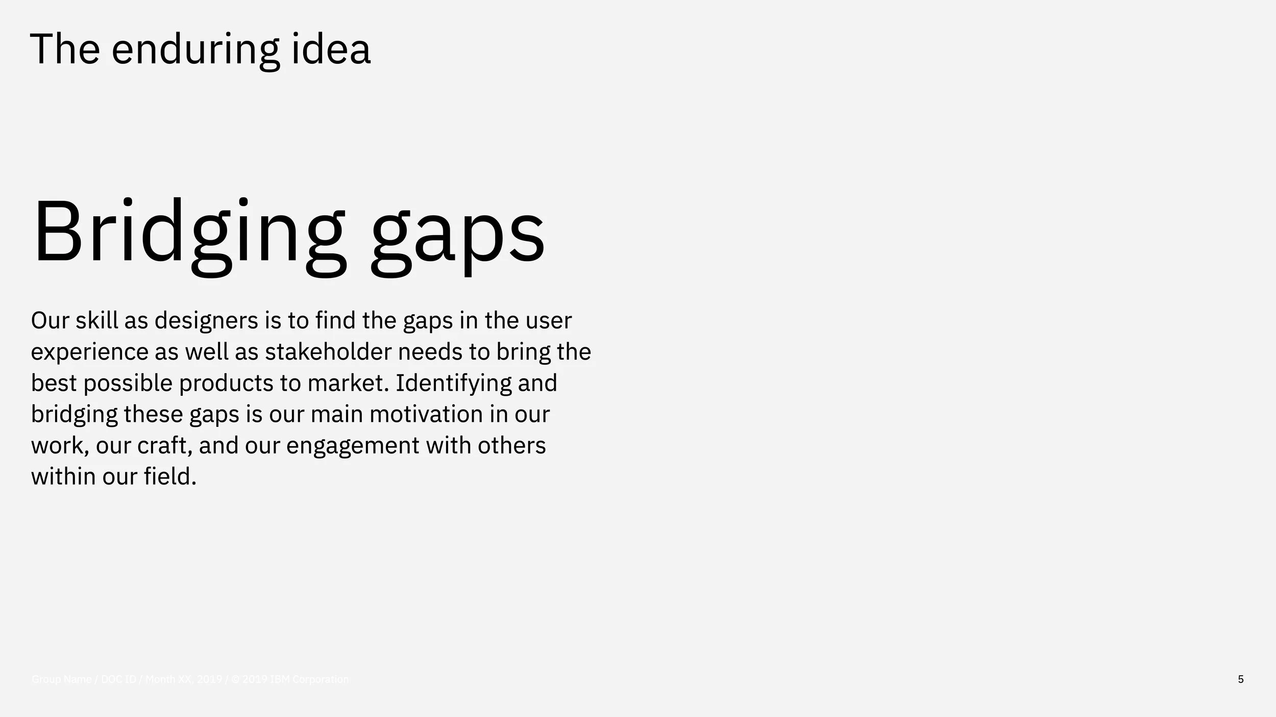
We began by identifying the conference’s objectives and the values we wanted its identity to communicate. Through collaborative workshops, thematic exploration, and concept development, we established Bridging Gaps as the central brand promise—a reflection of design’s role in connecting people, disciplines, and ideas. This concept became the foundation for our visual exploration, guiding the development of a flexible identity built around connection.
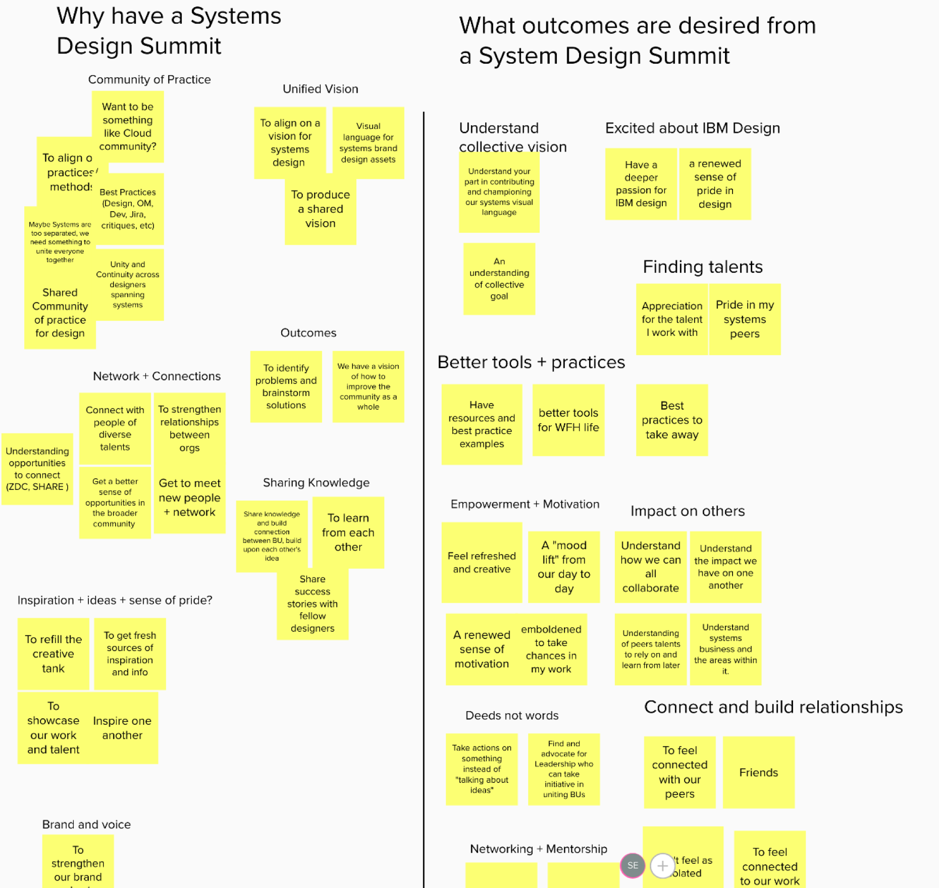
1. Align on themes of intent
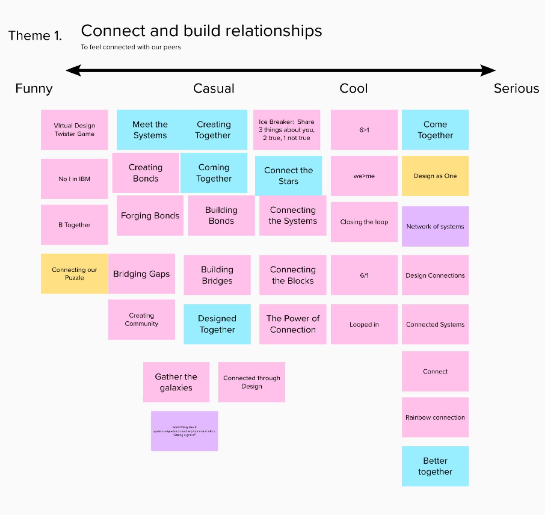
2. Explore thematic expressions
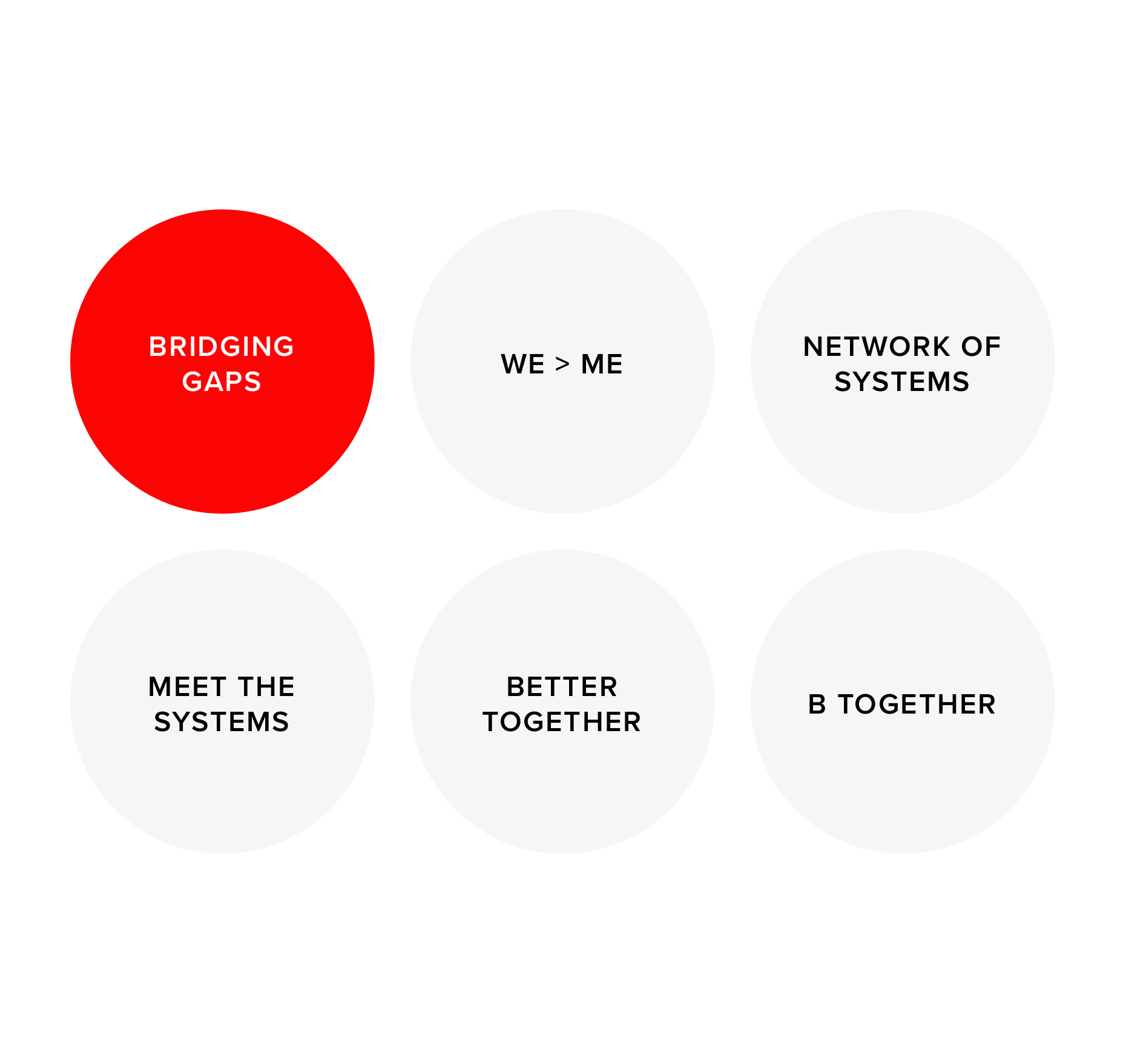
3. Converge on a brand promise
02 - Developing the Visual Identity
Transforming an abstract concept into a recognizable system
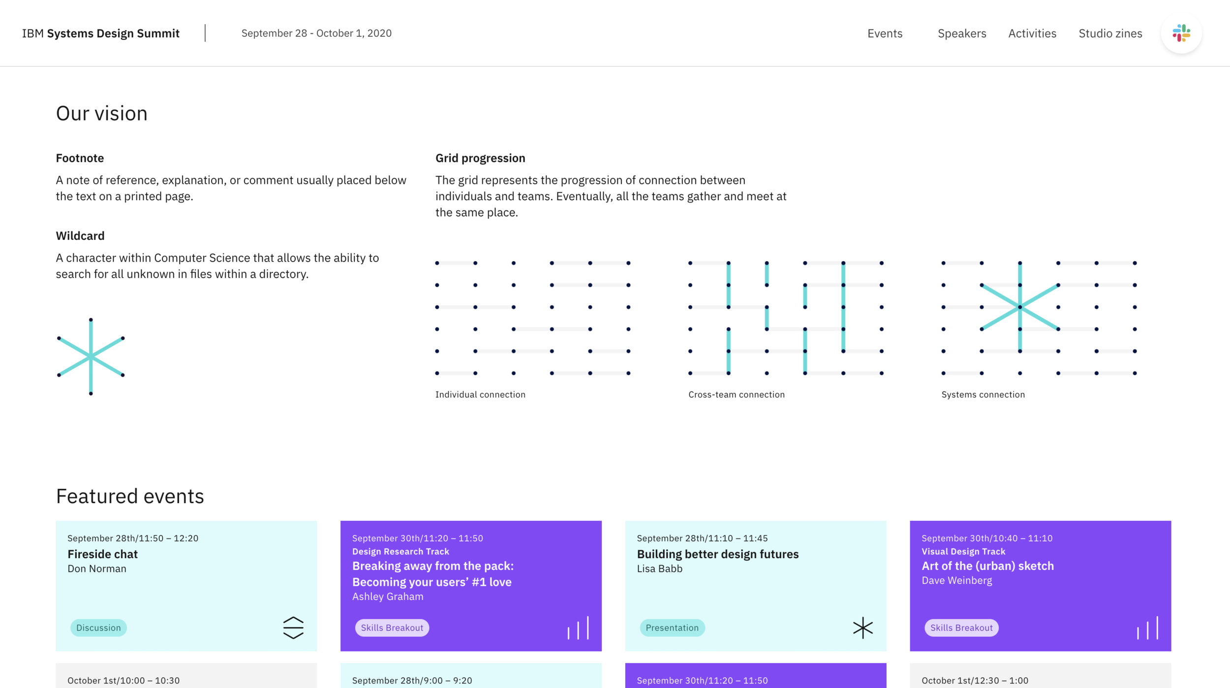
Inspired by the idea of connection, we explored visual representations of nodes, networks, and intersecting paths.
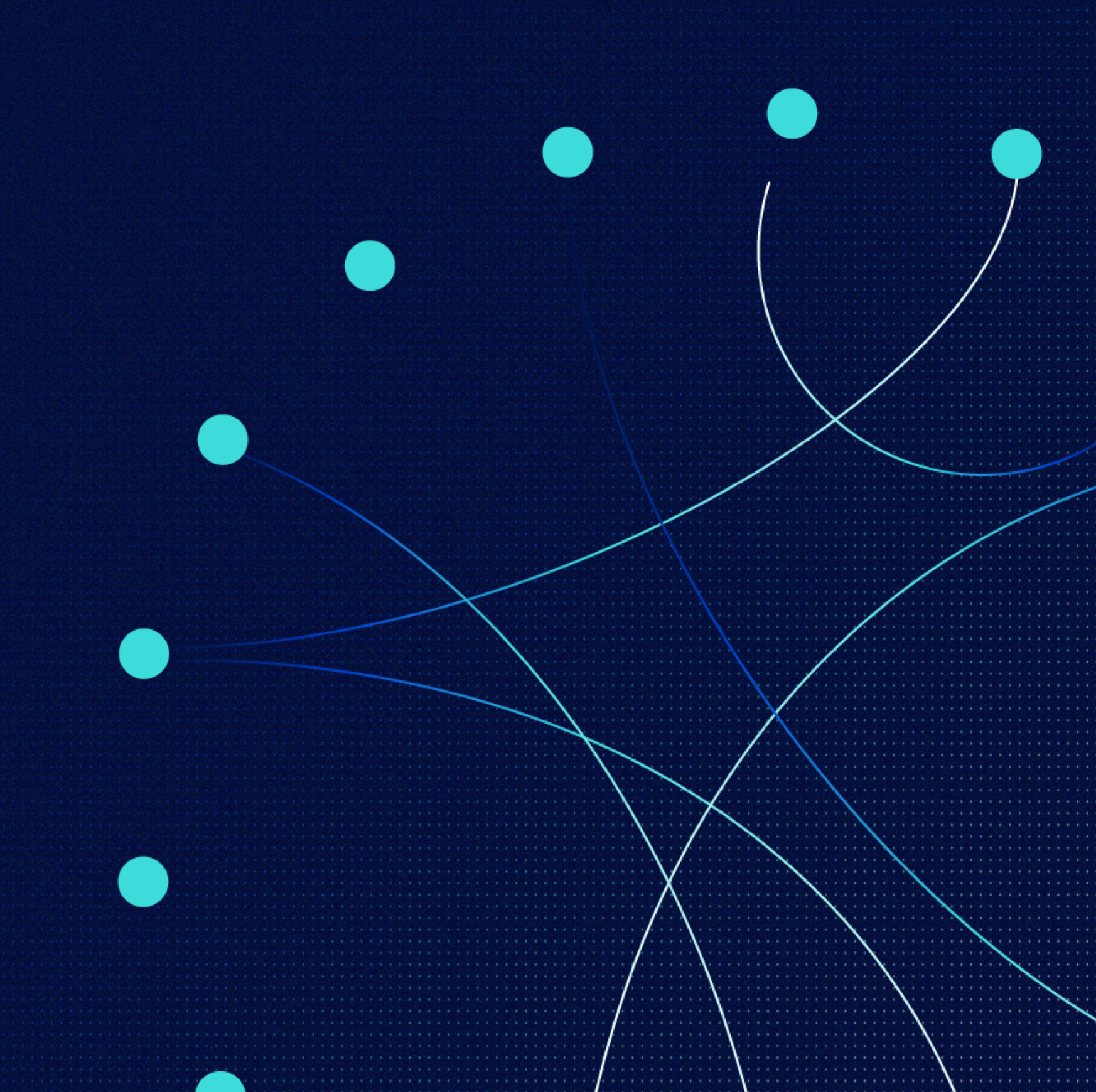
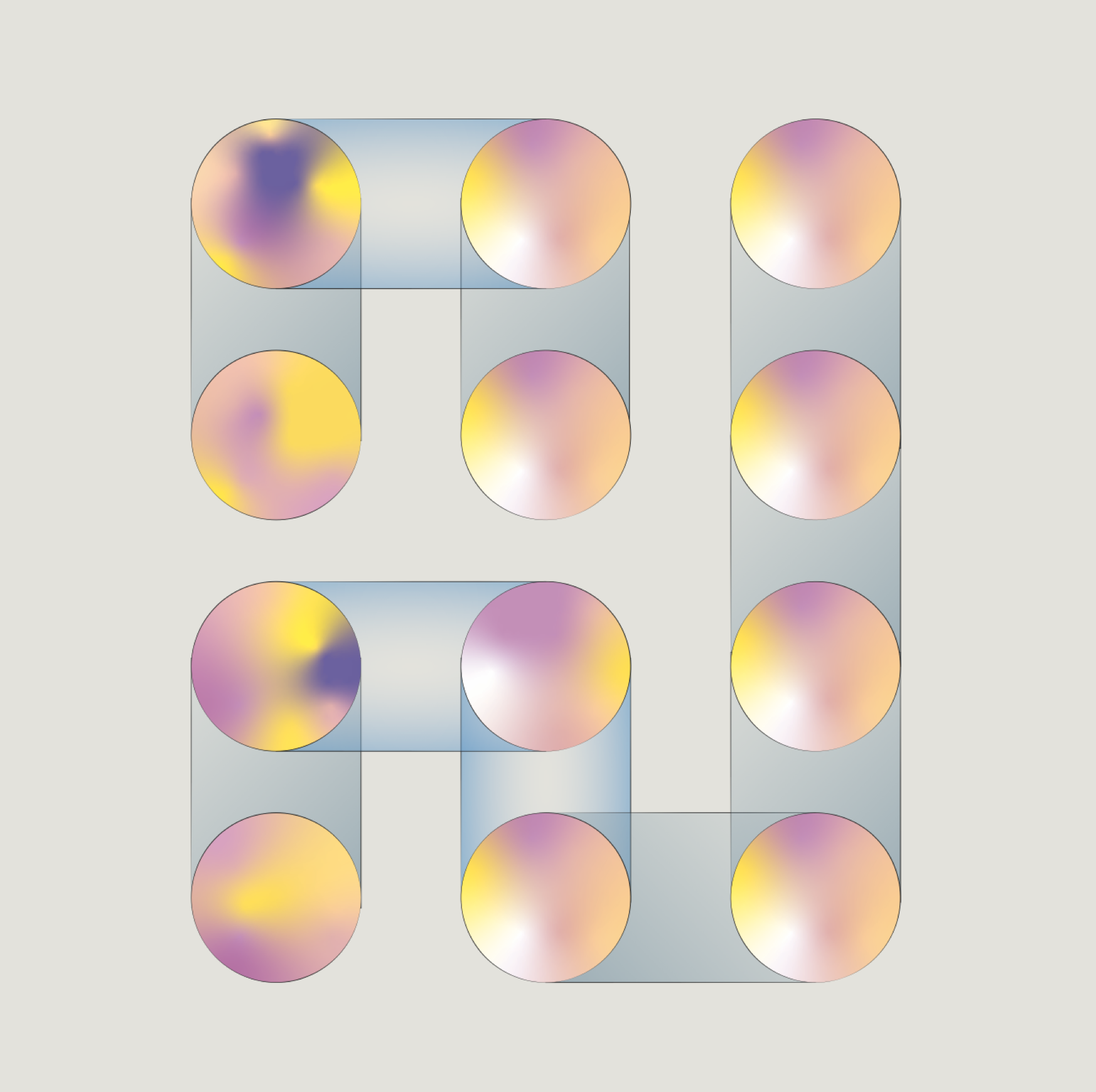
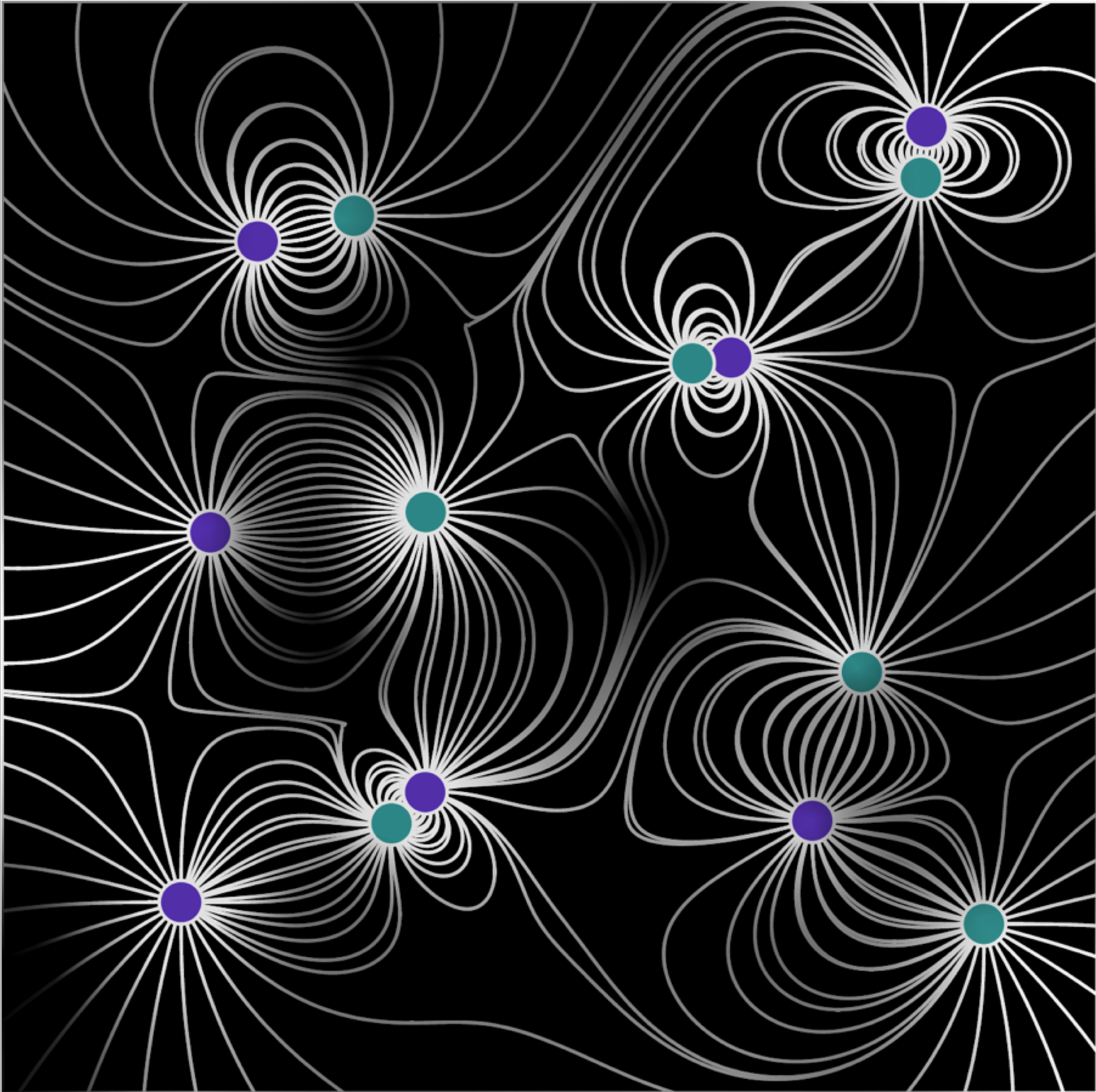
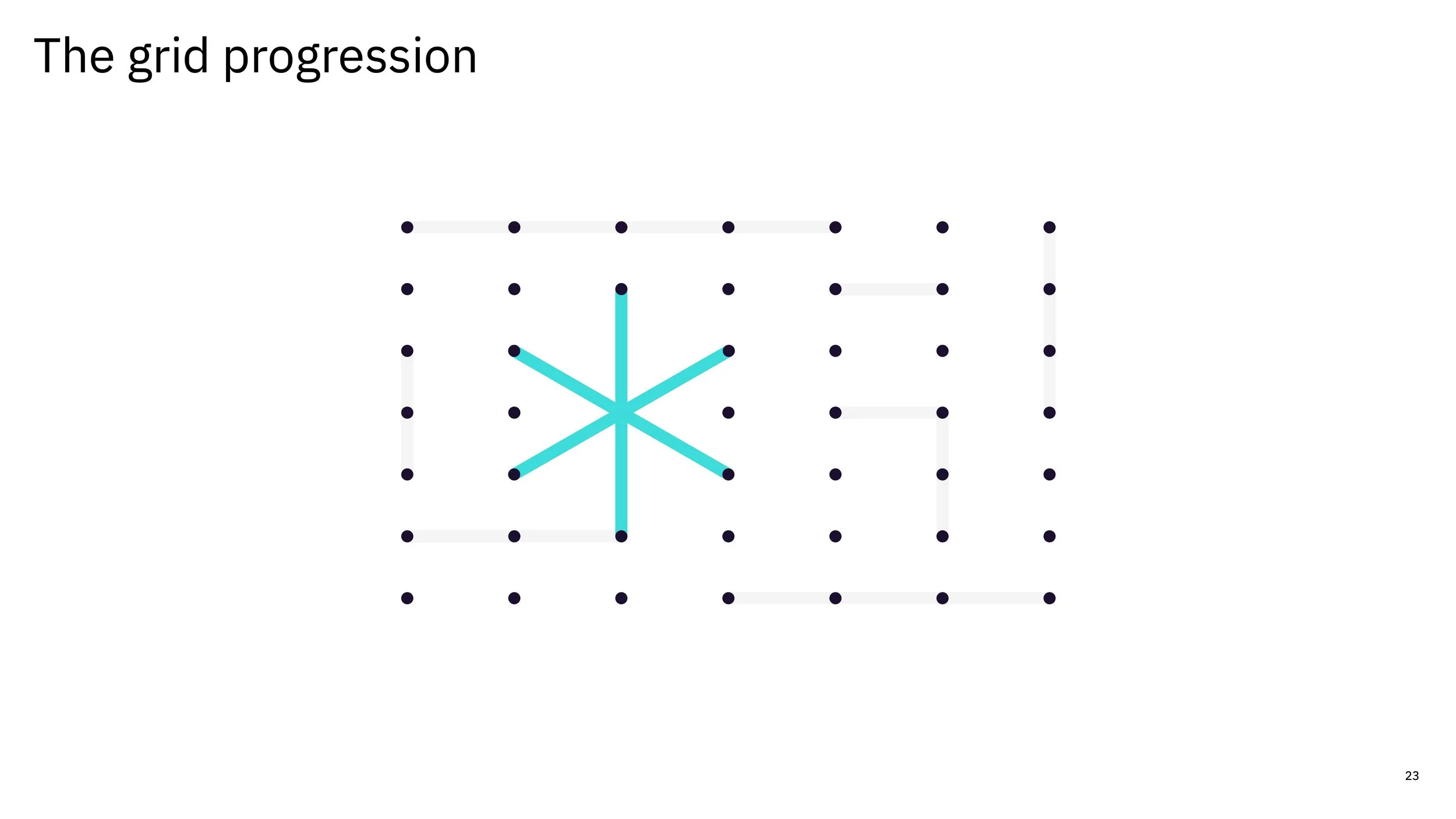
These explorations evolved into a geometric grid system illustrating three levels of connection: individuals, teams, and the broader organization.
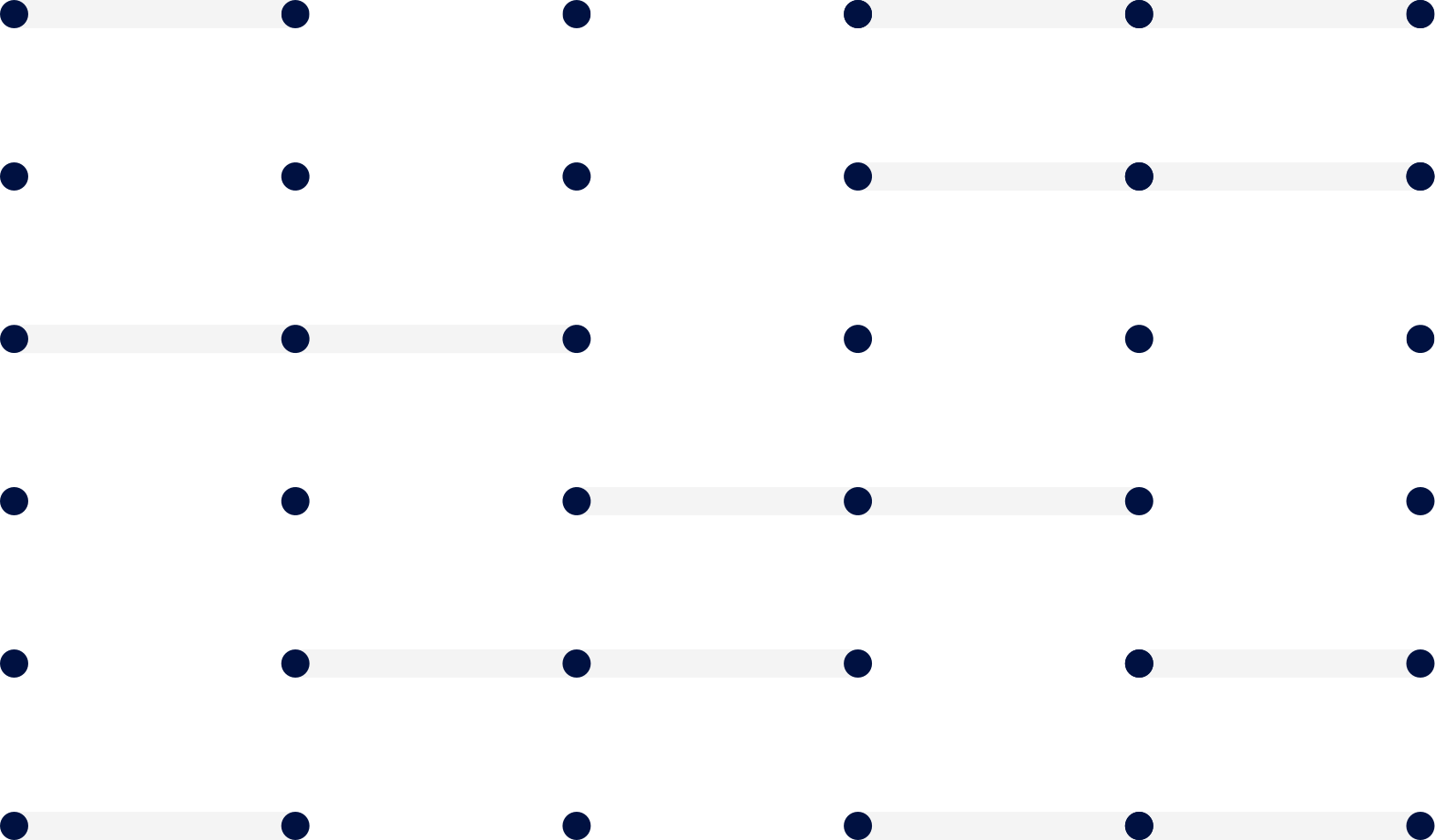
Individual connection
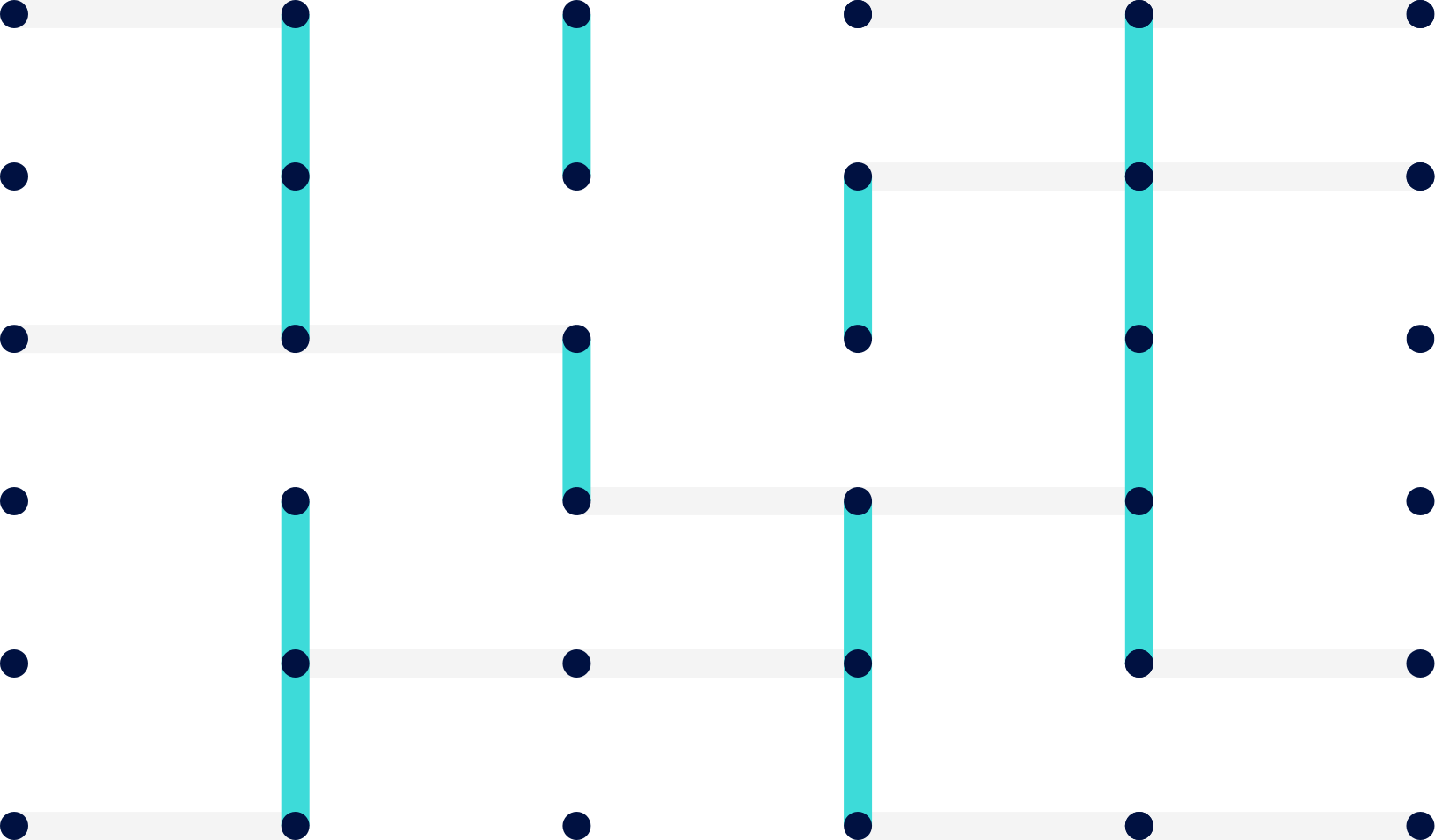
Team connection
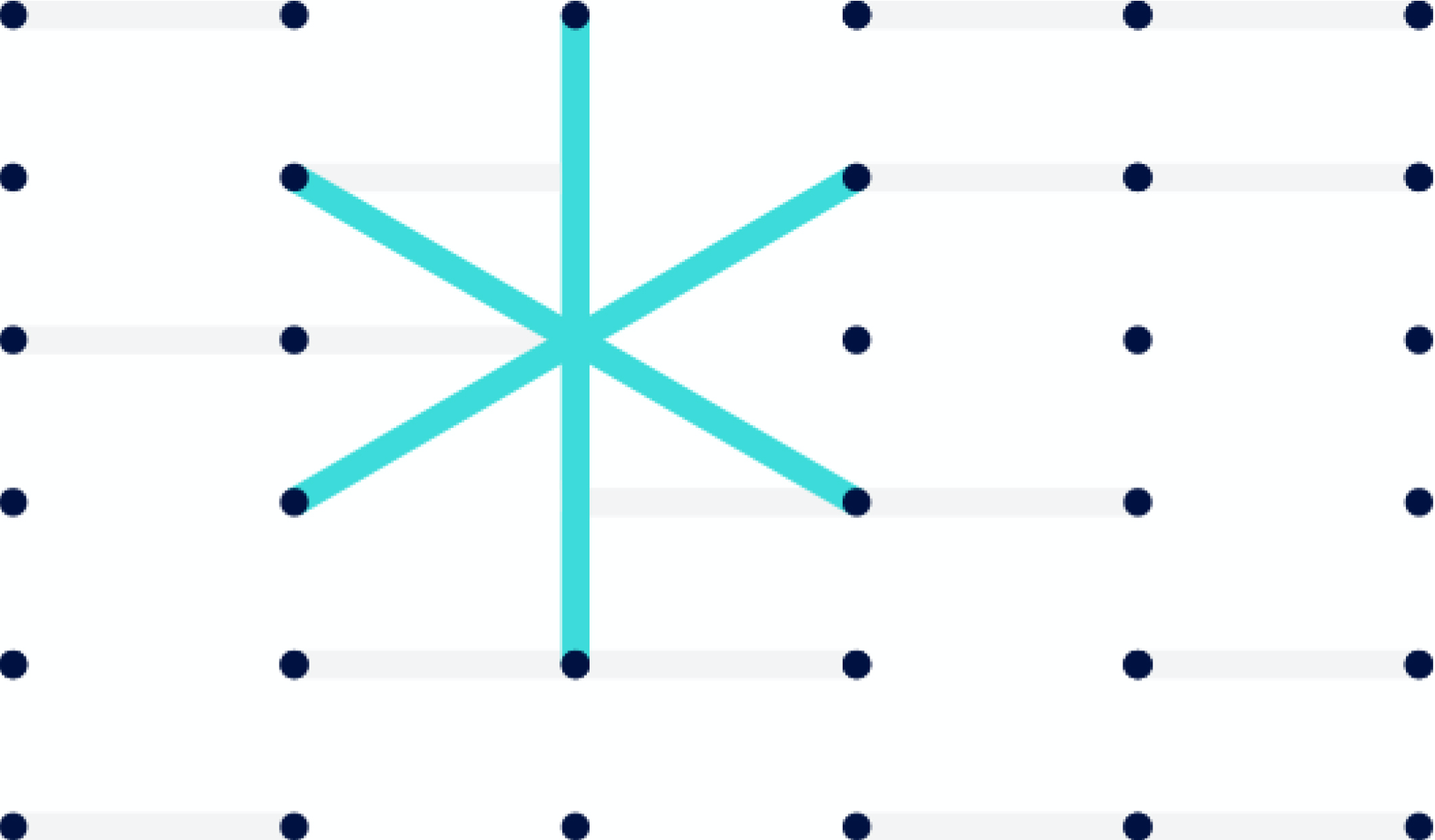
Systems connection
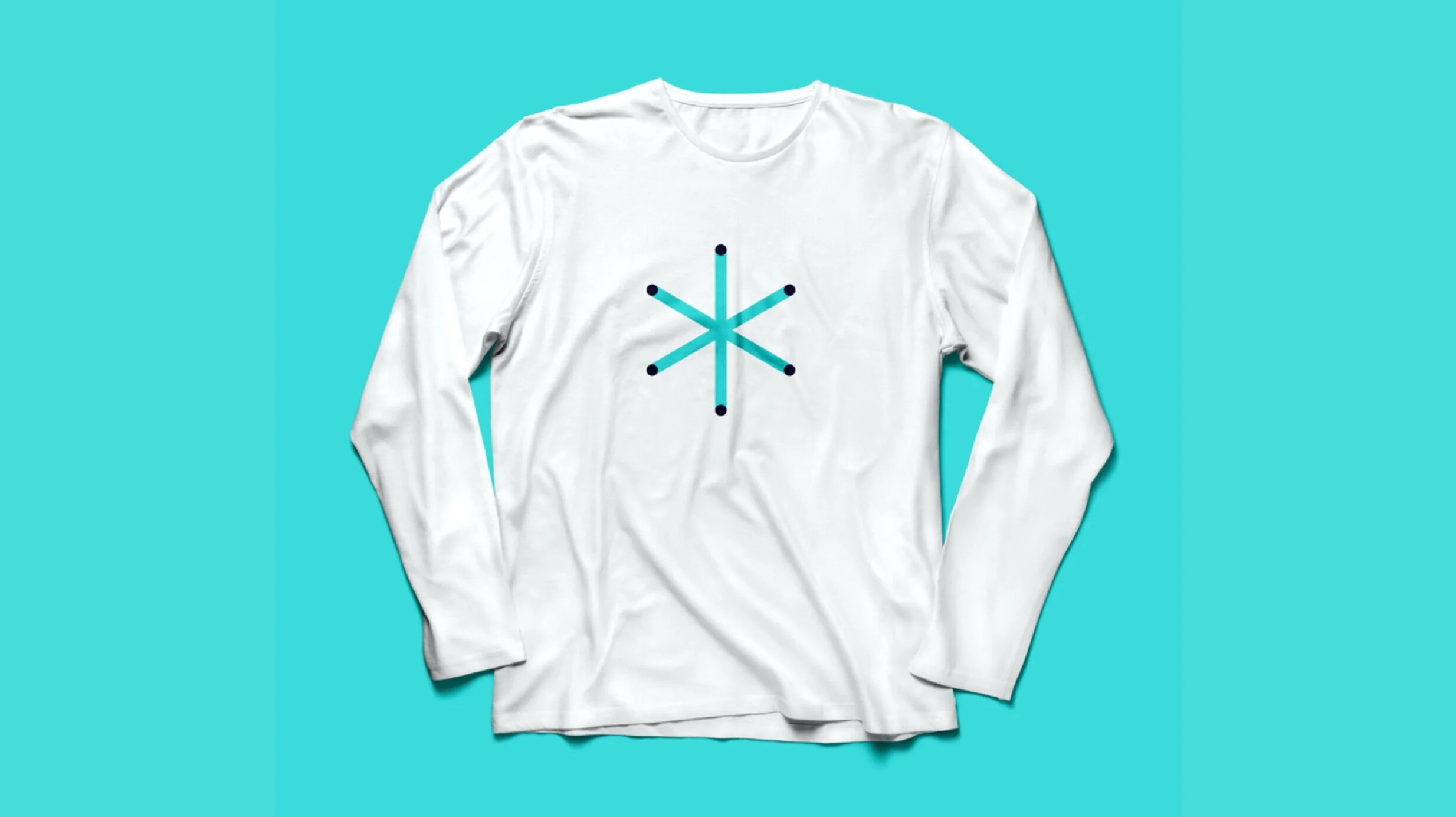
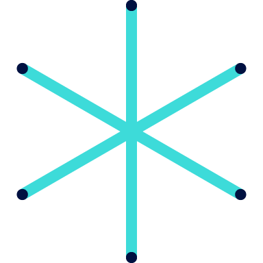
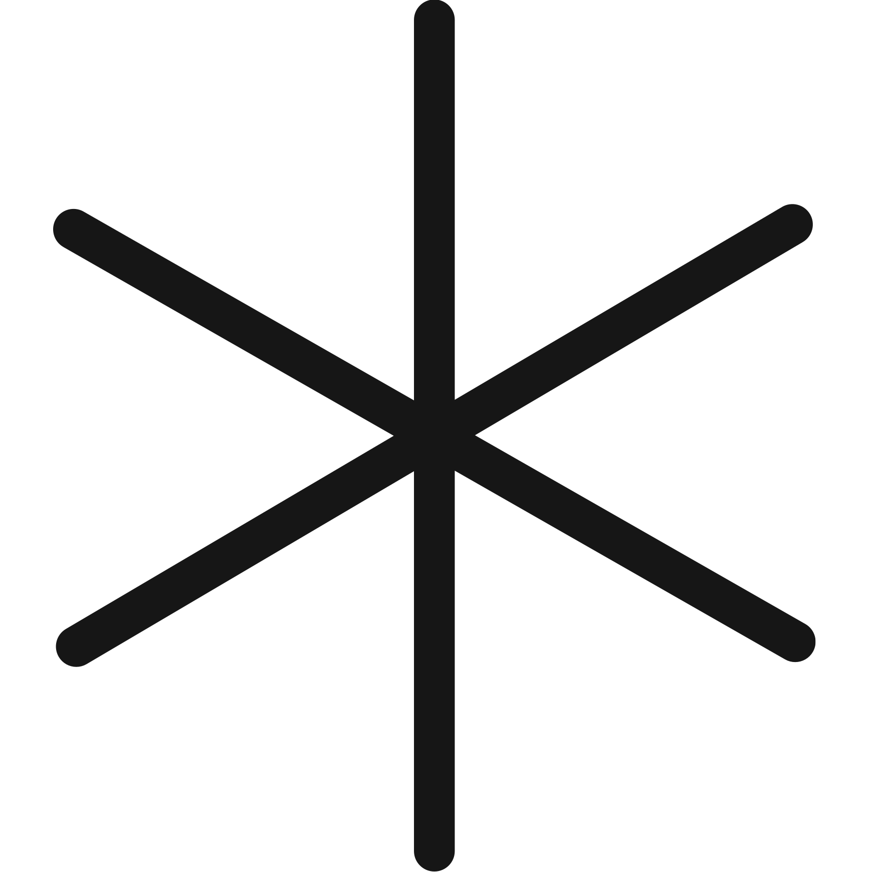
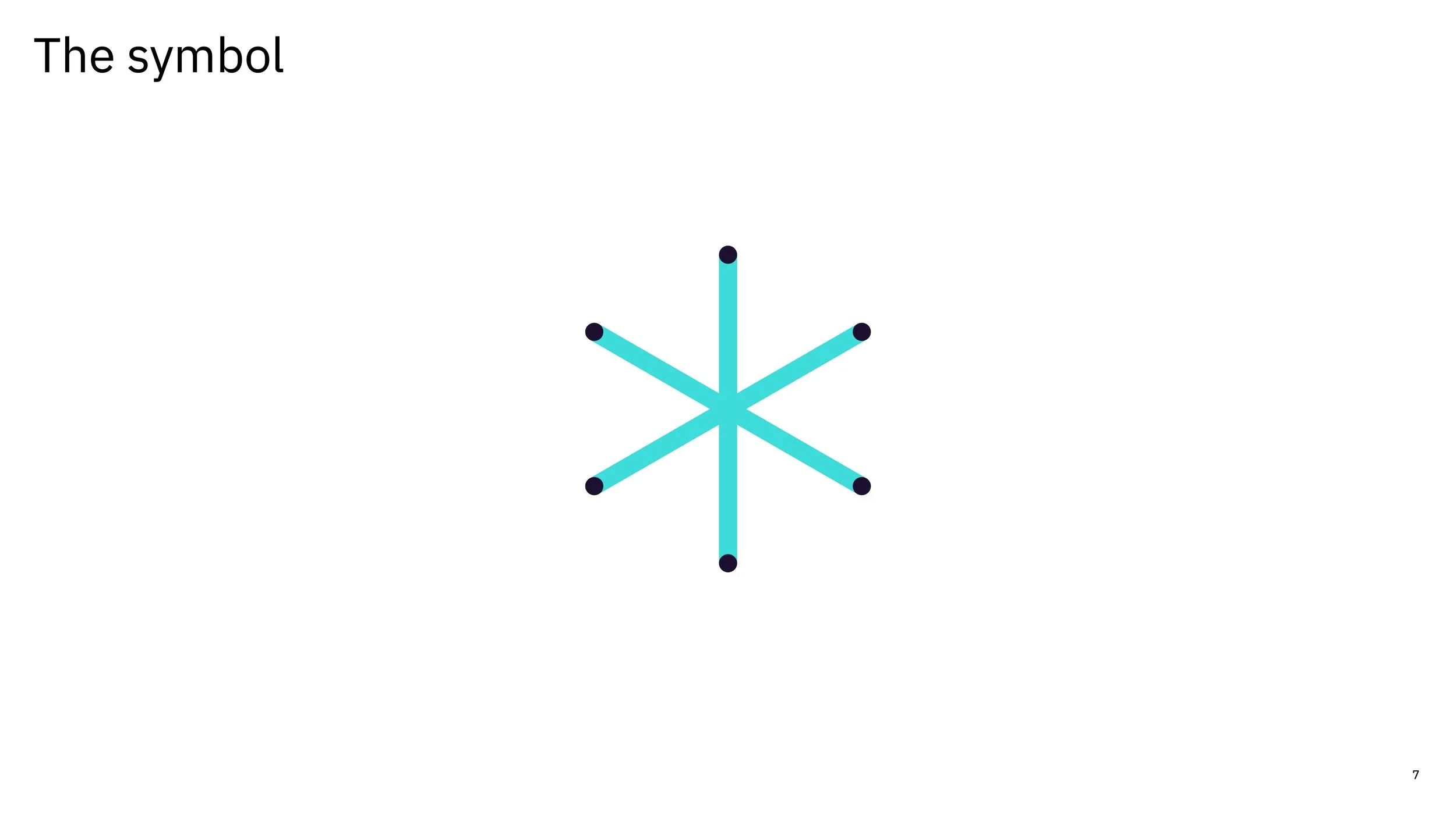
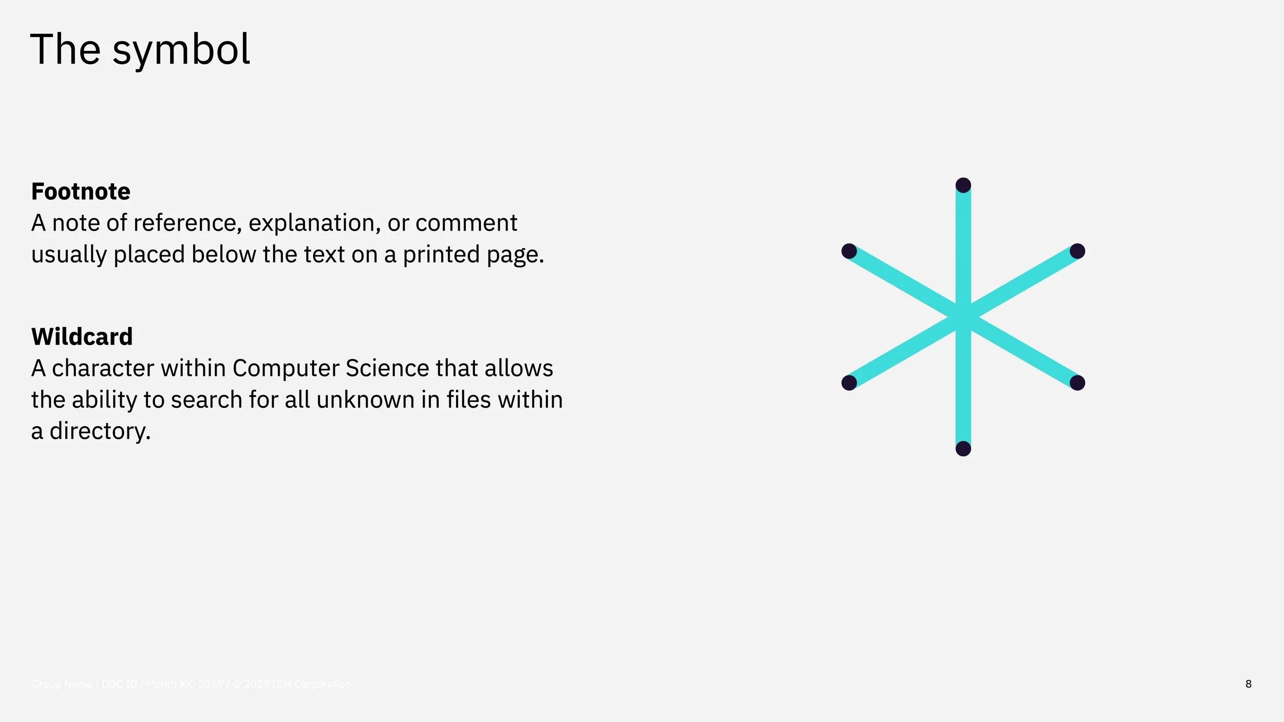
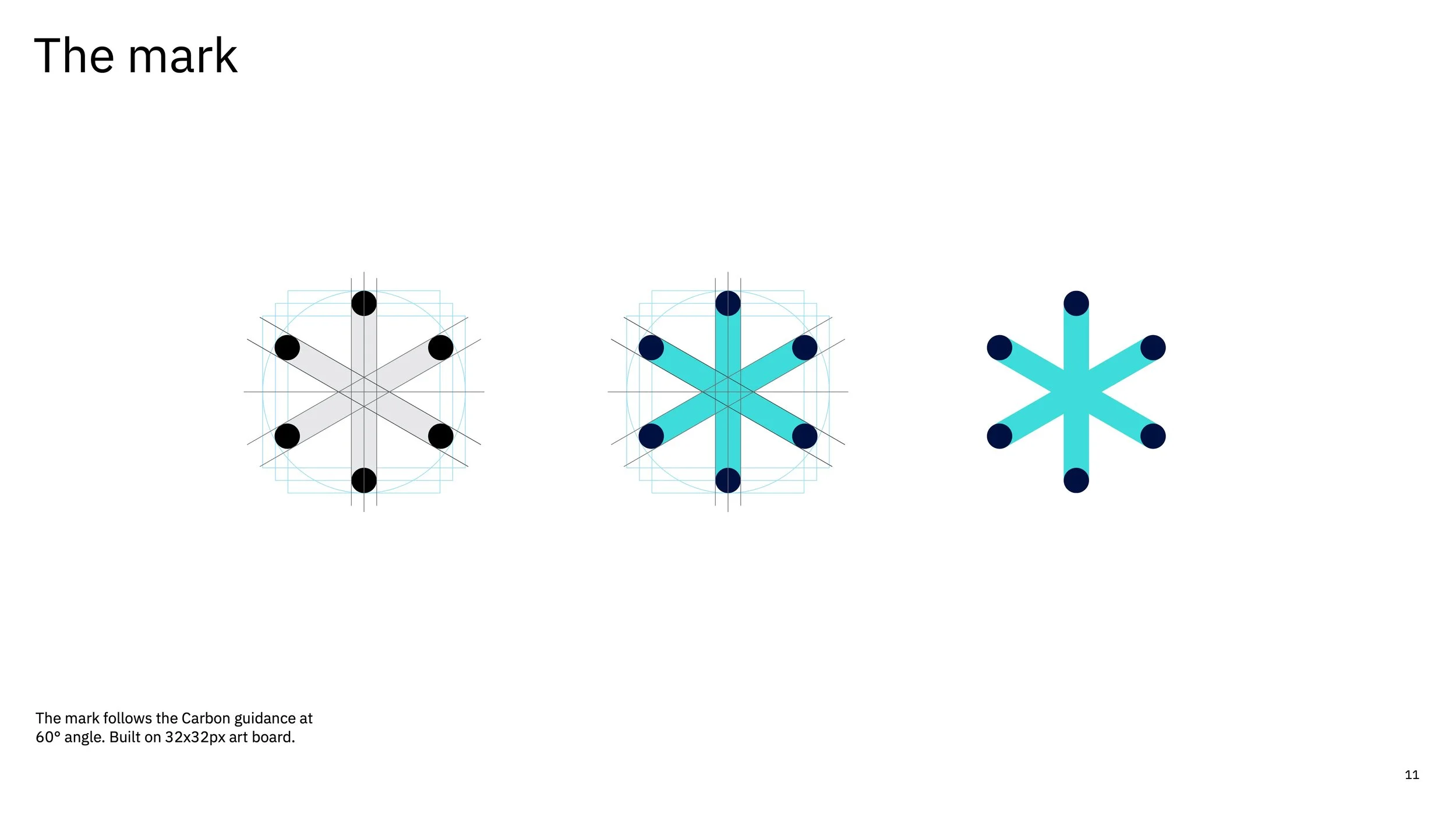
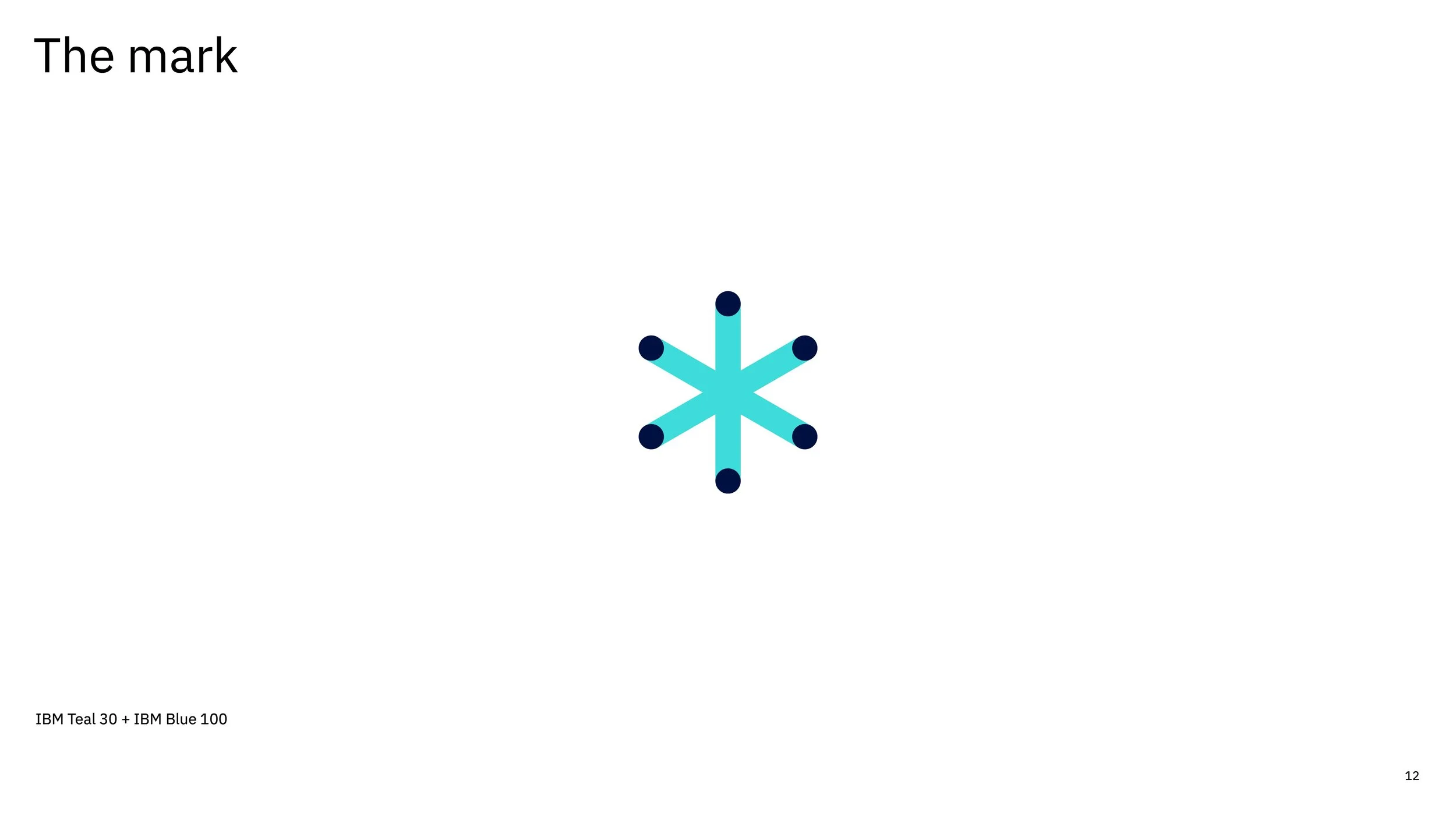
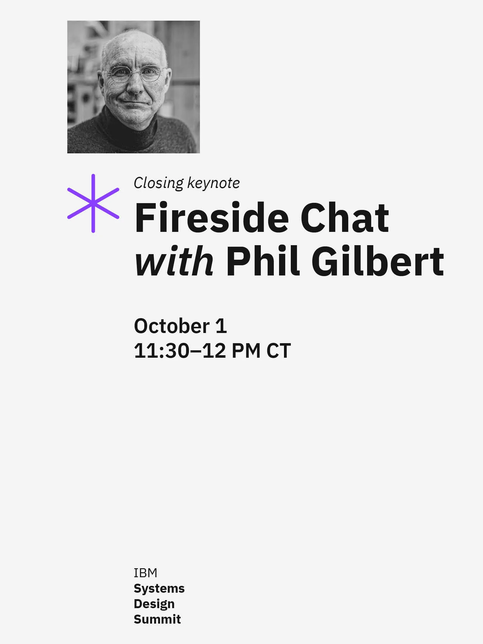
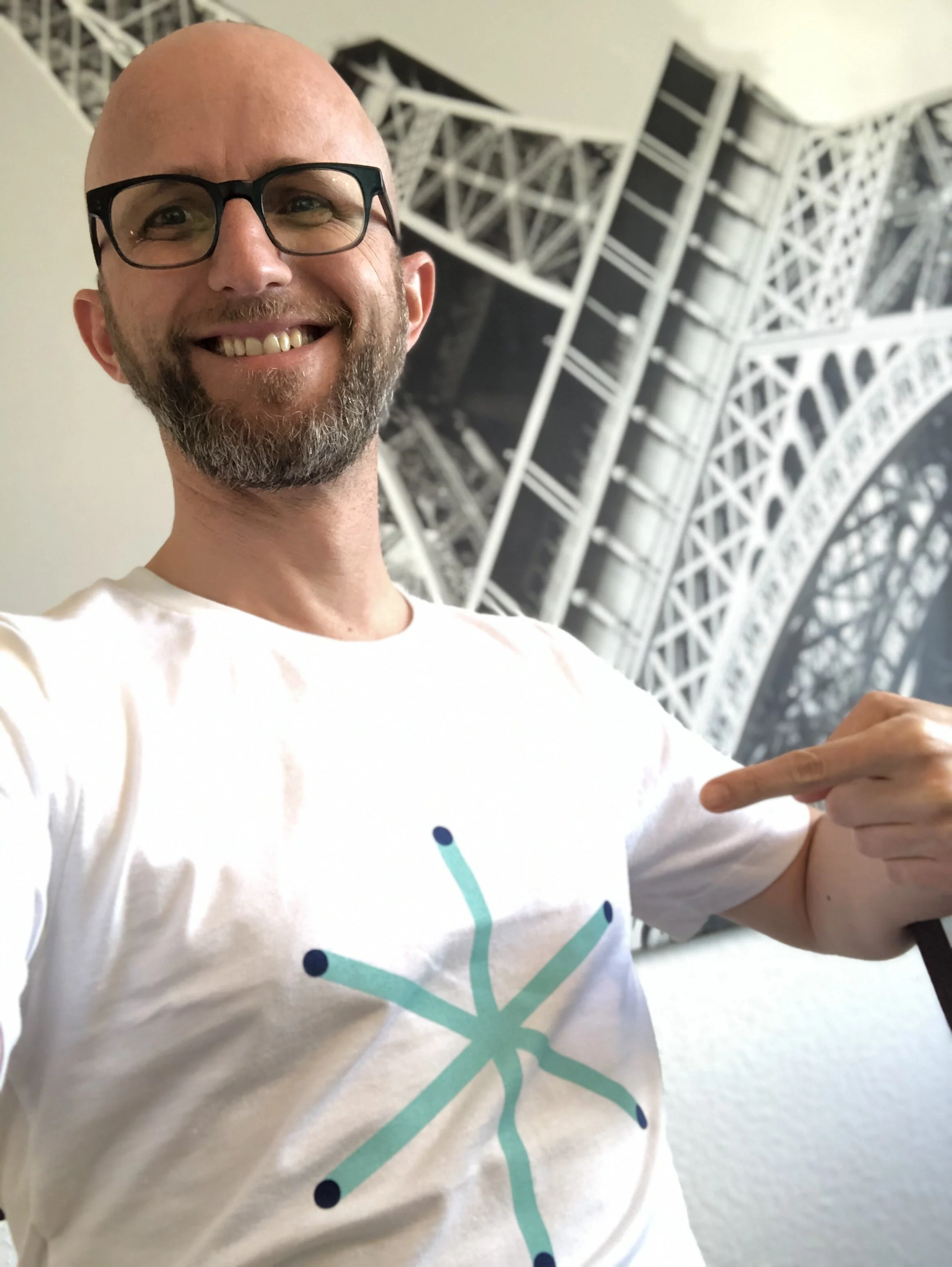
From this system emerged the conference’s signature asterisk—a simple, recognizable symbol representing both connection and possibility. The mark carried a dual meaning: a footnote symbol suggesting additional context and a wildcard character representing exploration and the unknown.
03 - Establishing the visual language
Creating a flexible and cohesive design system
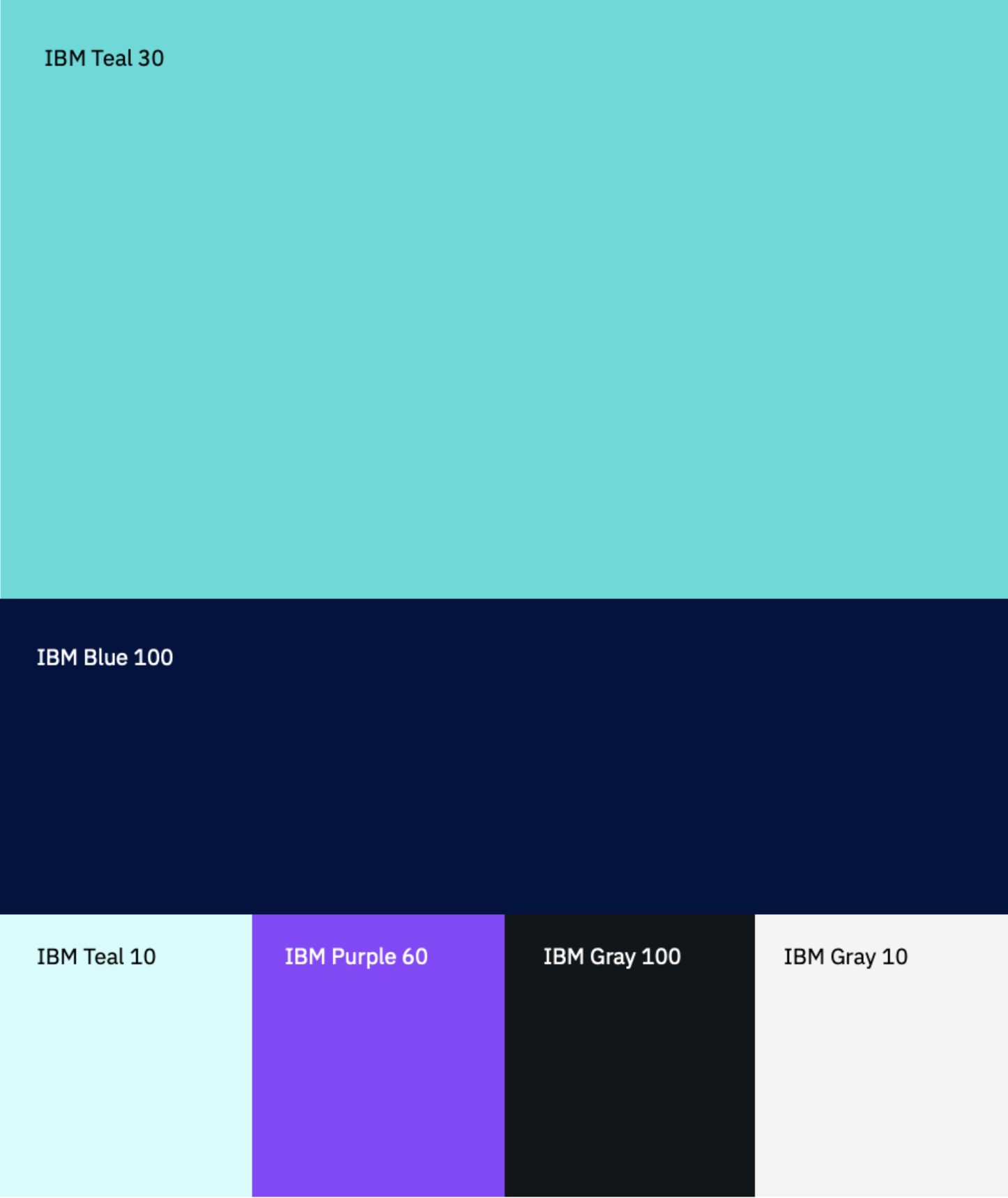
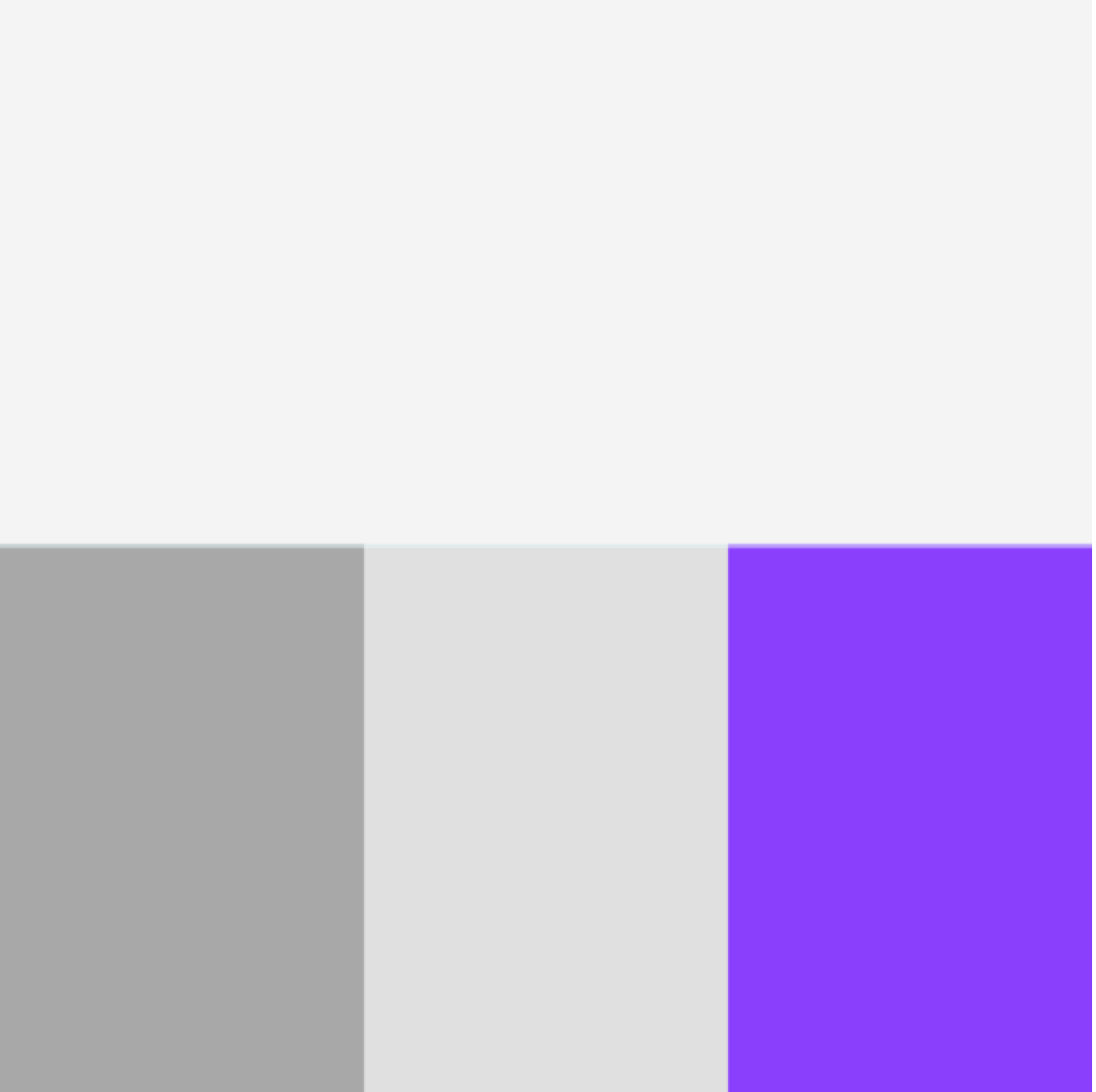
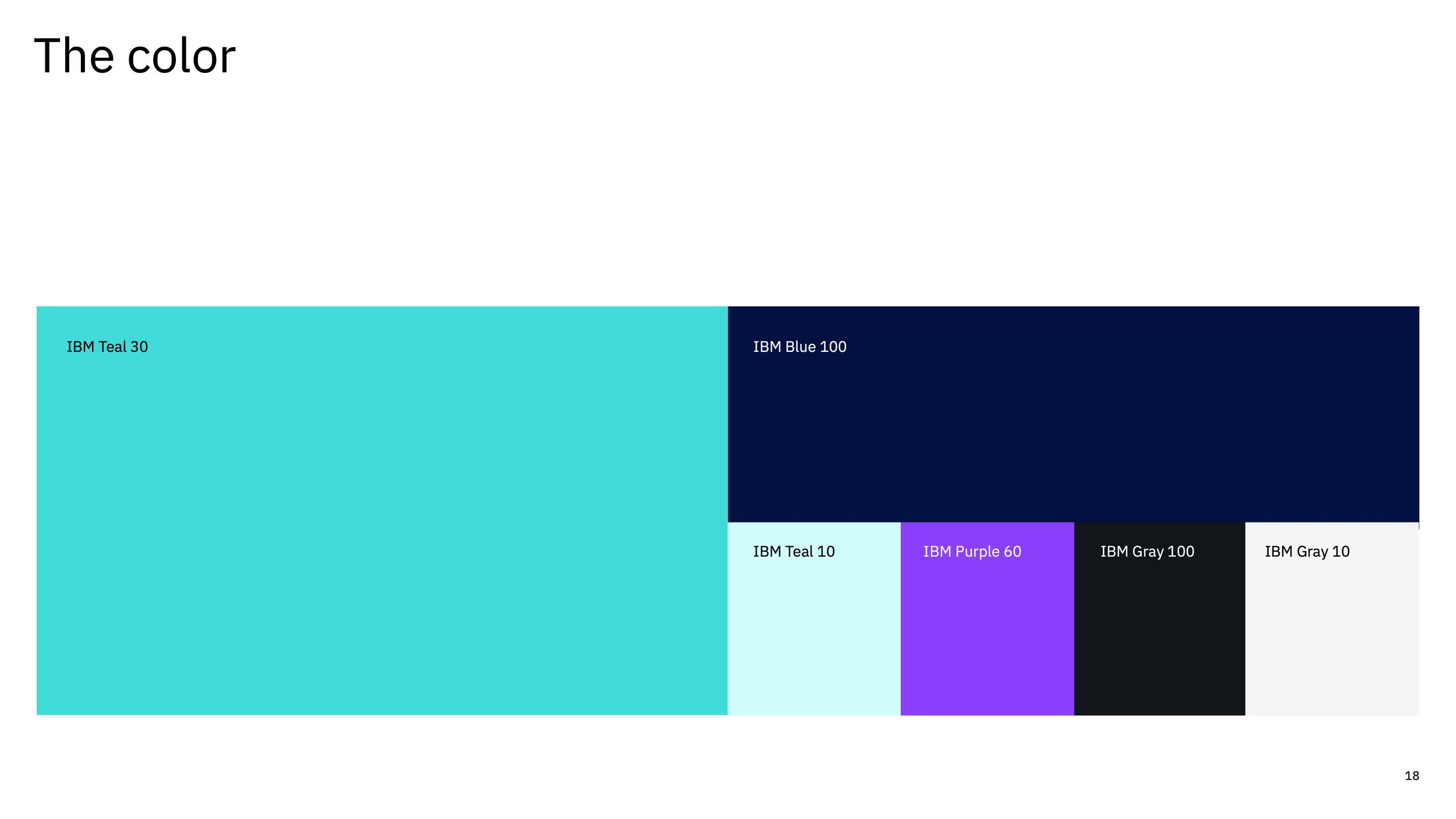
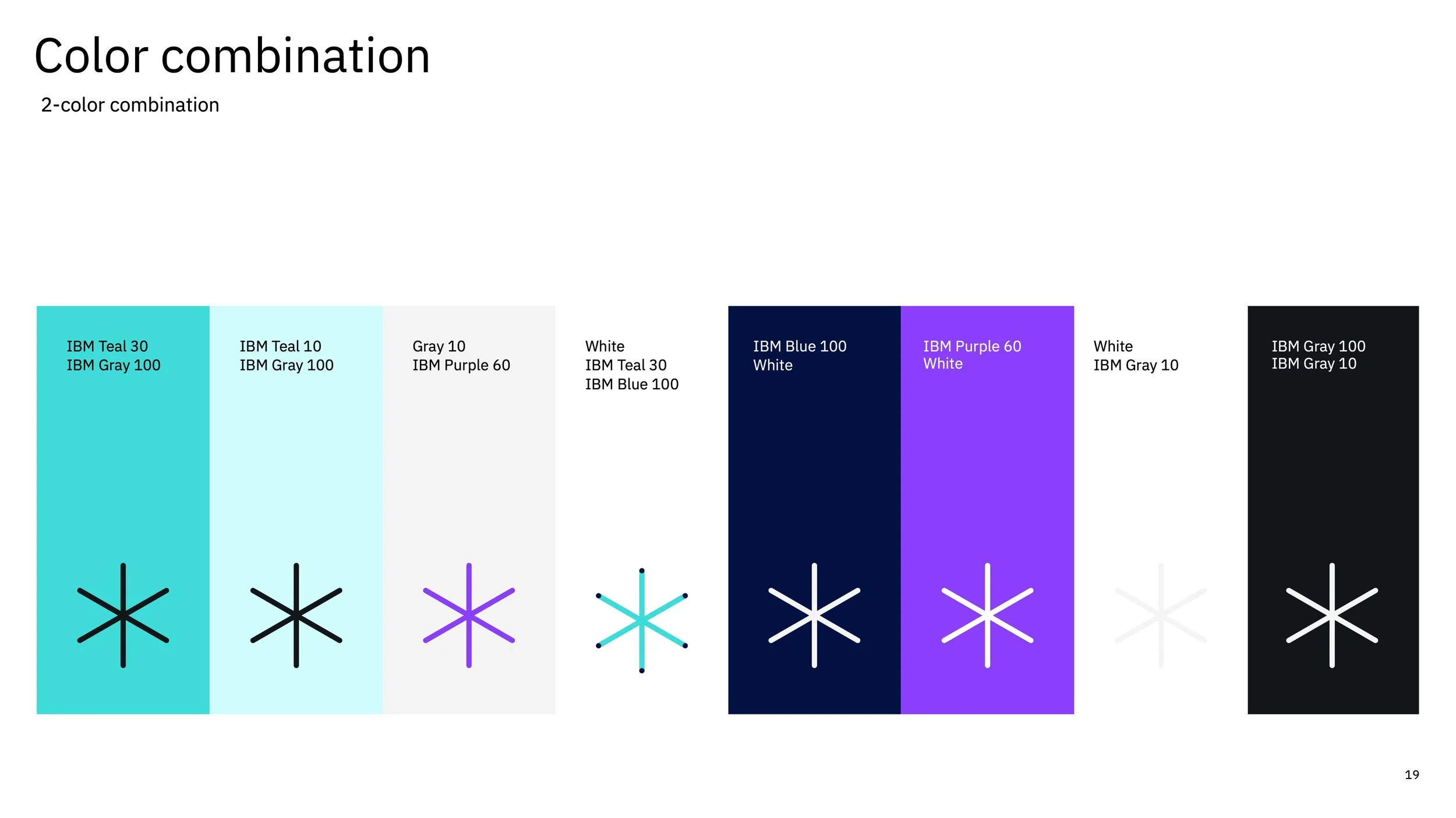
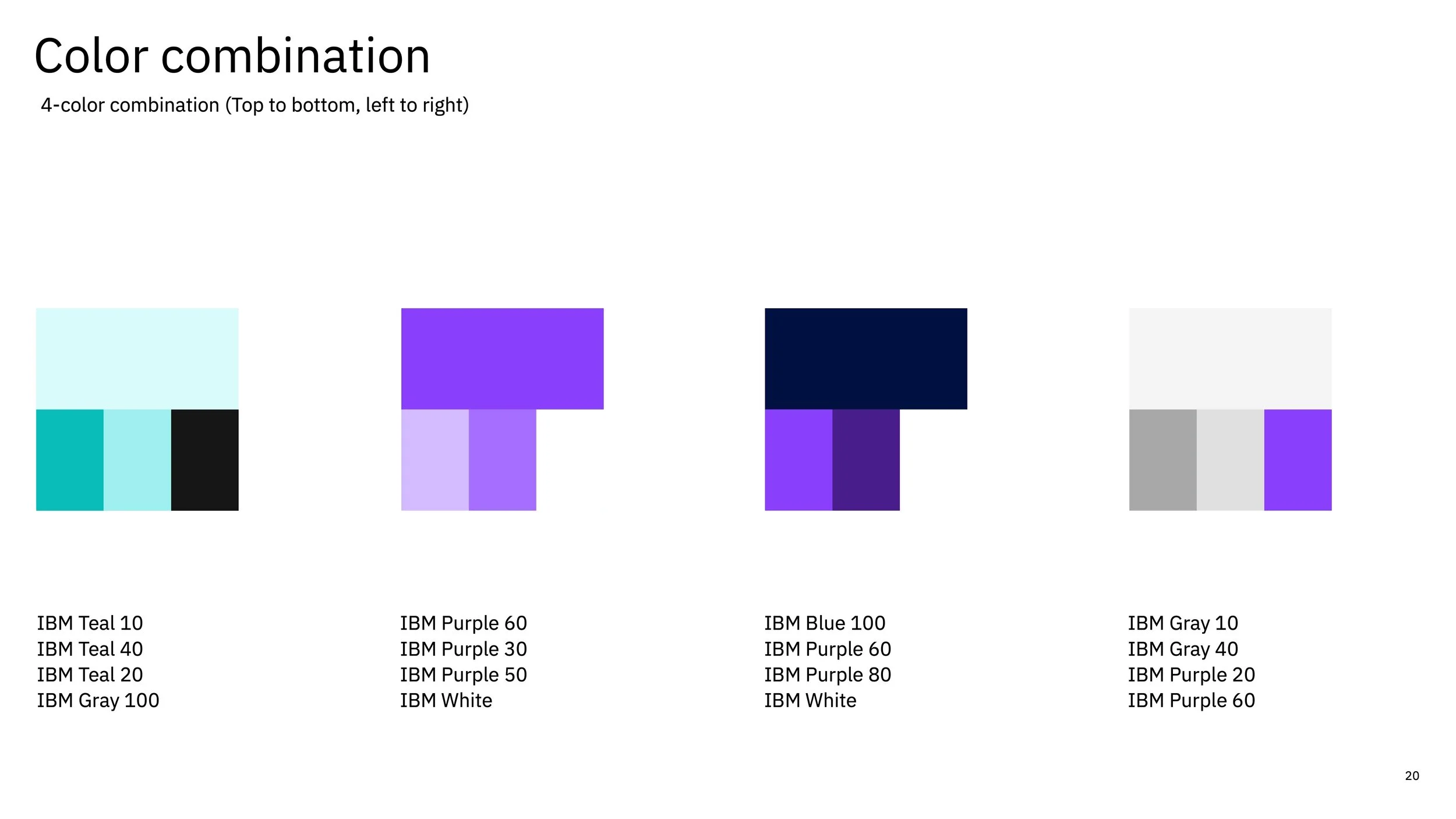
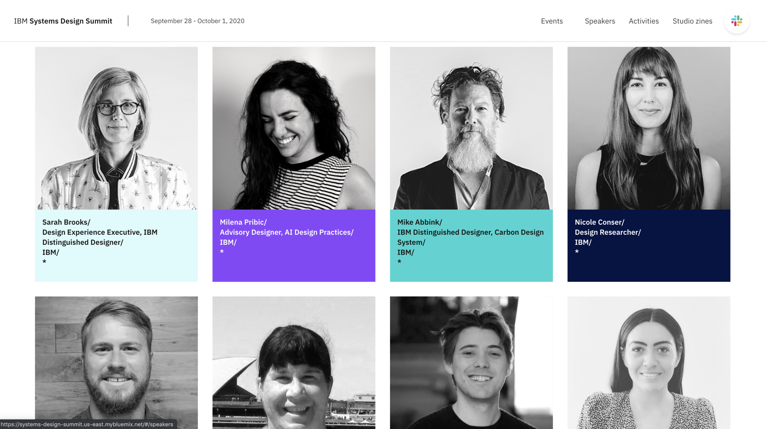
With the core identity established, we developed a supporting visual language built around typography, color, geometry, and modular composition. A palette of teal, blue, purple, and neutral tones created a cohesive foundation, while distinct color variations helped differentiate the conference’s daily themes. The resulting system balanced consistency with flexibility, allowing the identity to evolve across different experiences without losing its recognizable character.

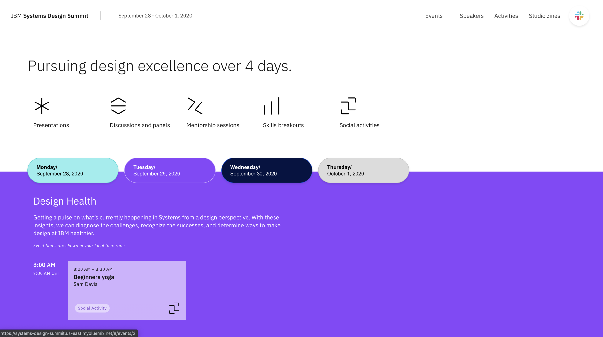
Day 1: Design Success

Day 2: Design Health

Day 3: Refining Craft
Day 4: Strengthening Community
04 - Extending the brand
Designing for consistency across every touchpoint
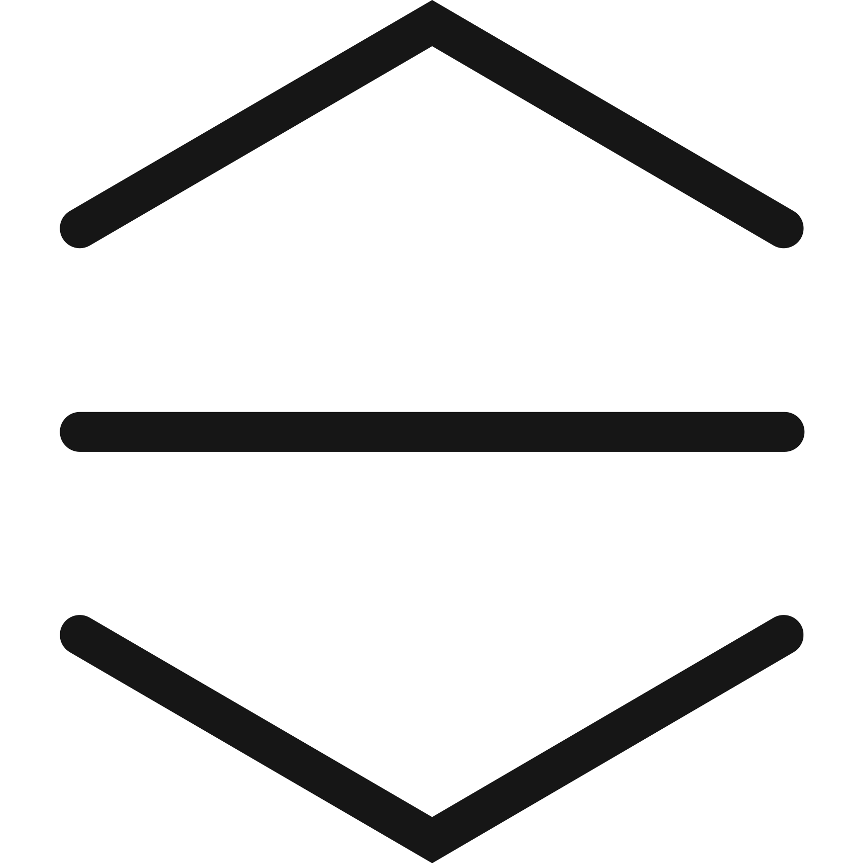
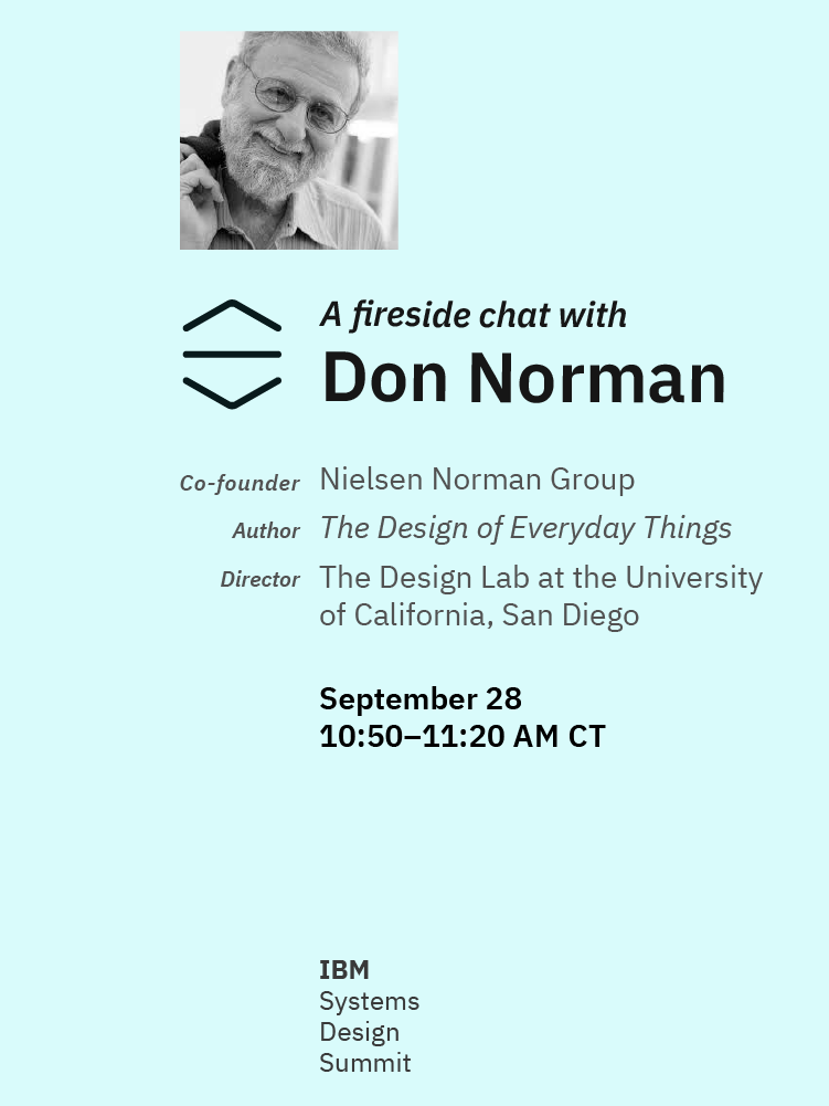
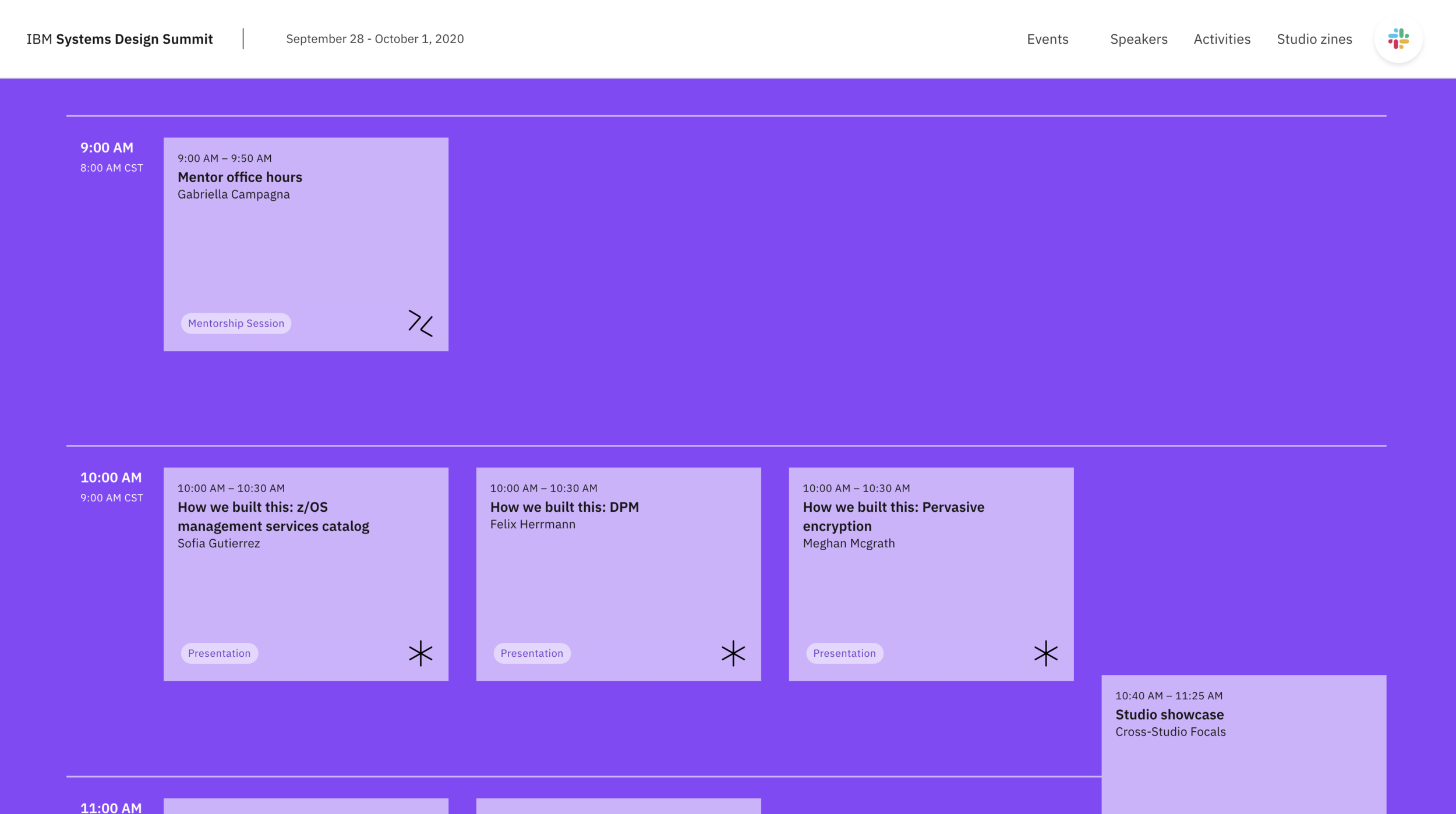
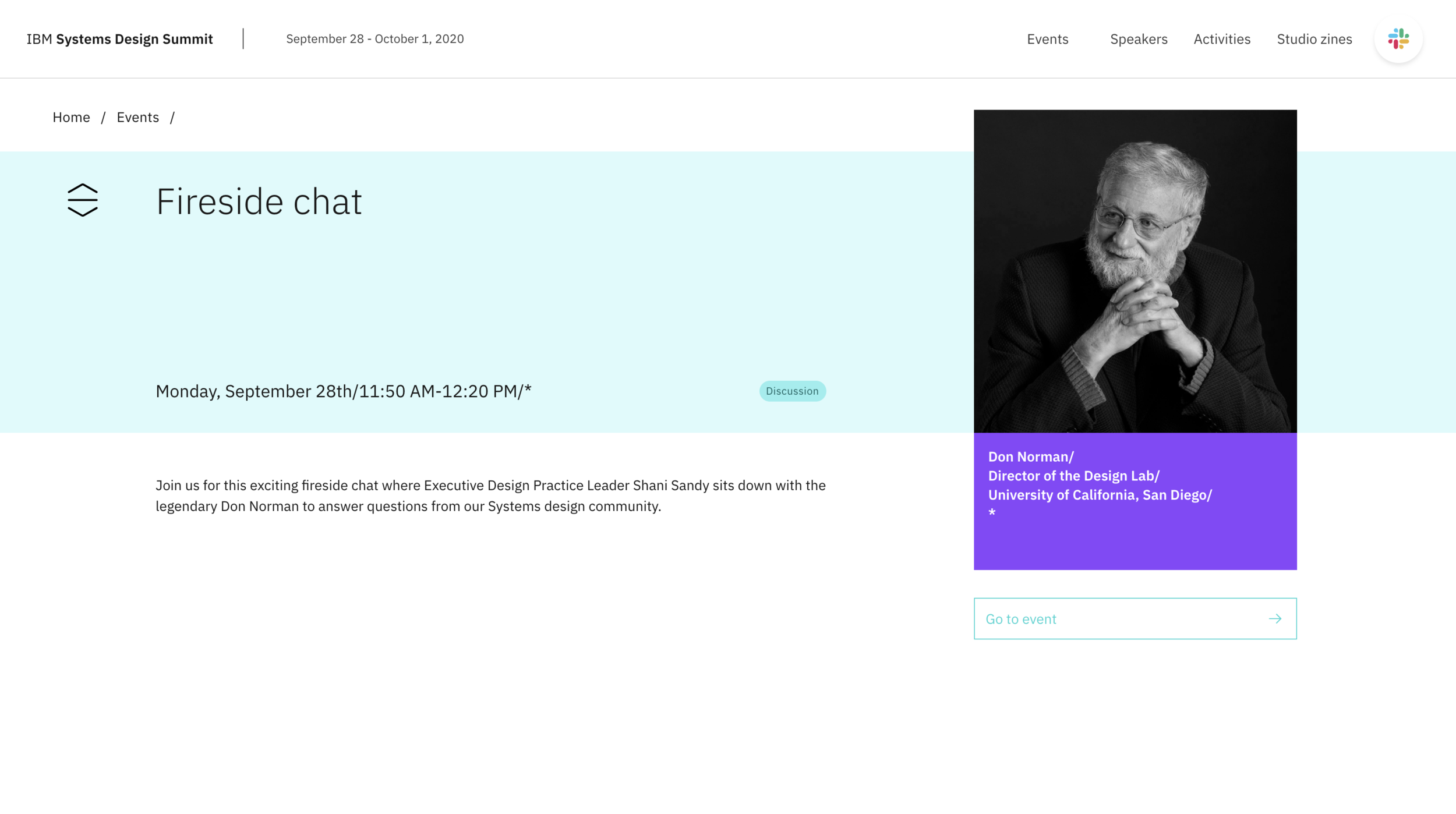
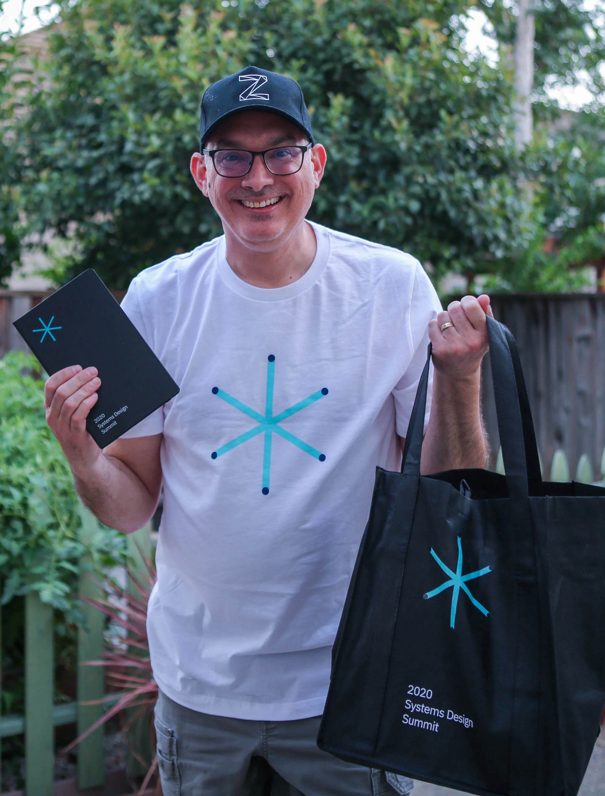
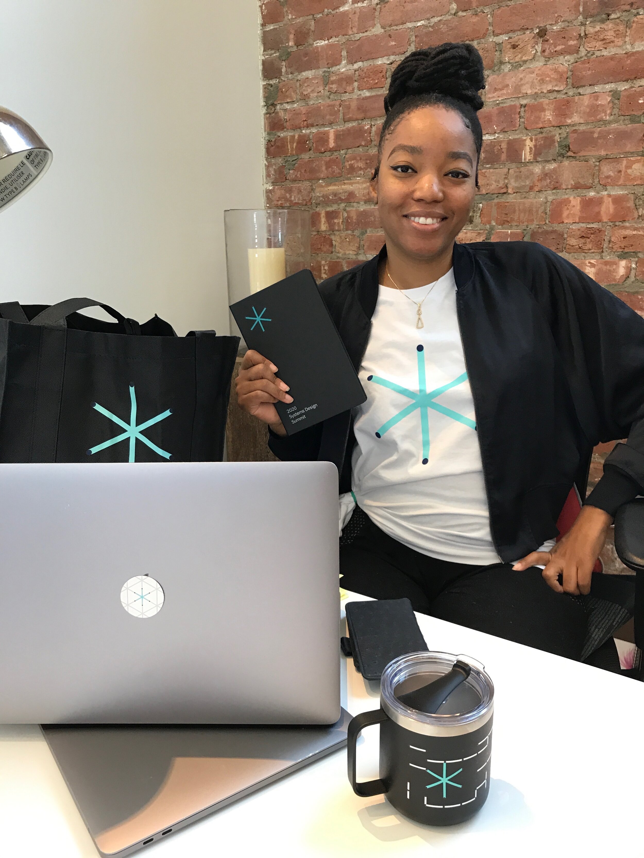
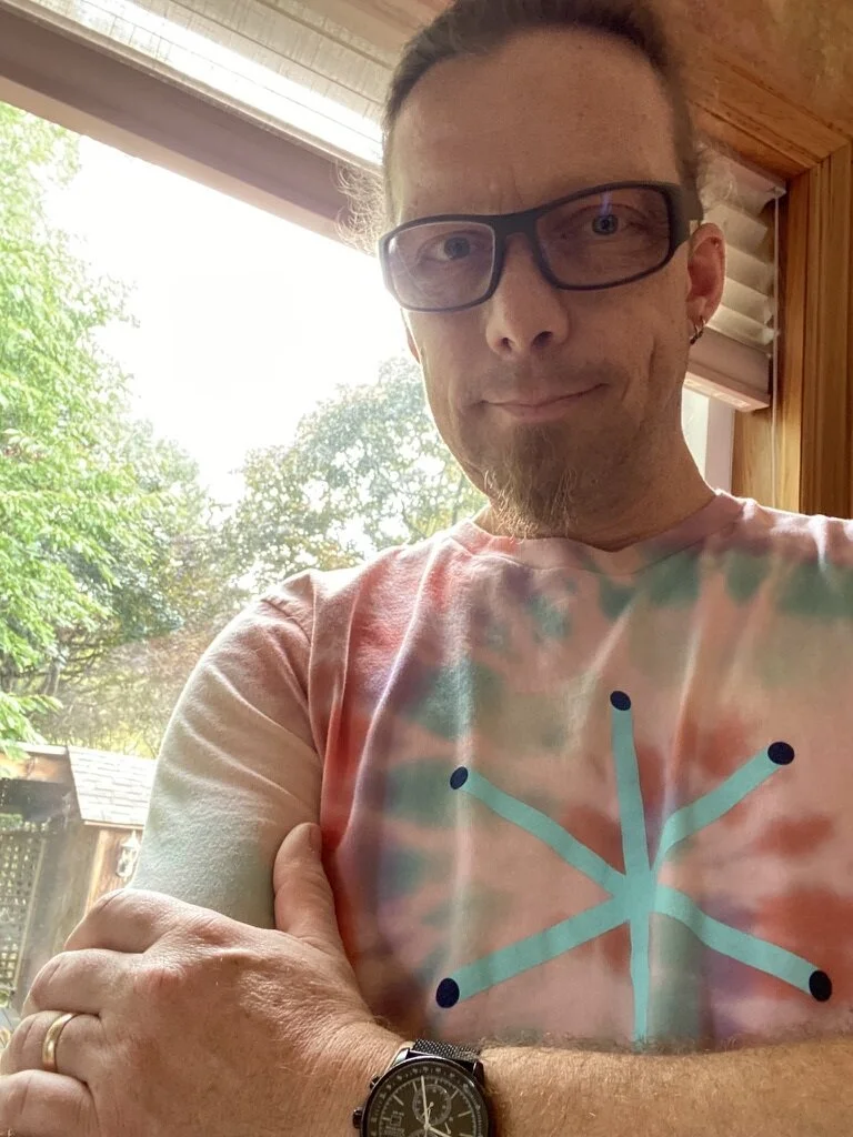
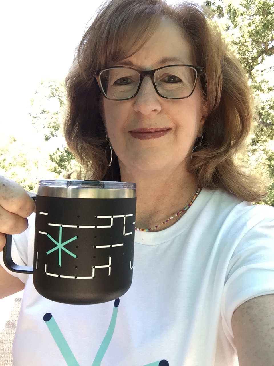
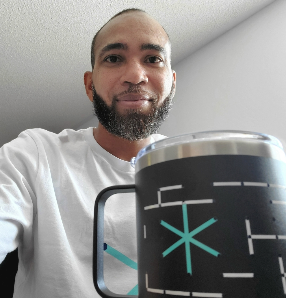
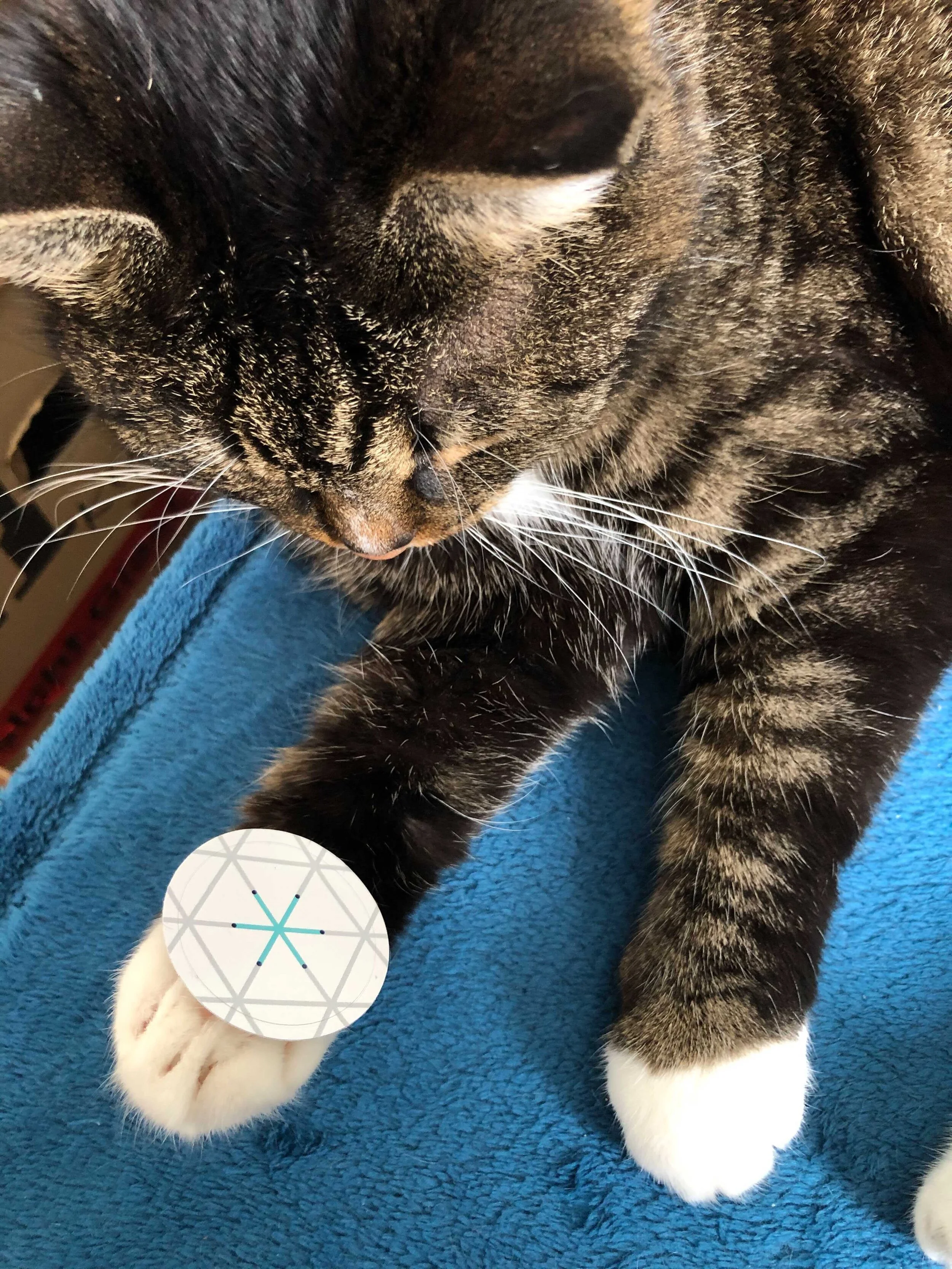
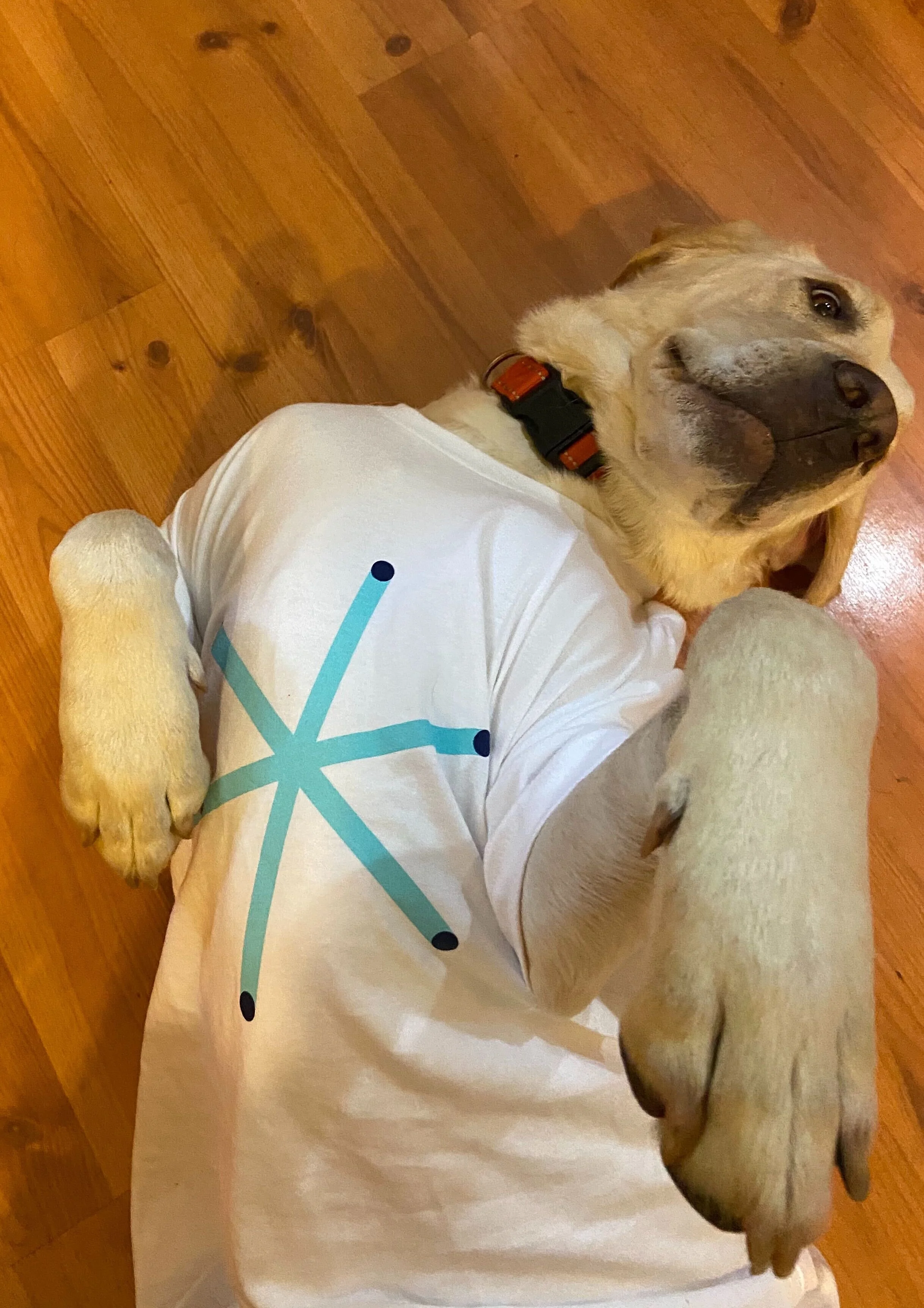
We expanded the visual system into a family of custom symbols representing the conference’s different event formats, including presentations, panel discussions, mentorship sessions, workshops, and social activities. Each symbol was constructed using the same underlying geometric principles, creating a consistent visual vocabulary. The identity was applied across a wide range of touchpoints, including the conference website, digital schedules, presentation materials, promotional graphics, and branded merchandise.
Presentations
Discussions and panels
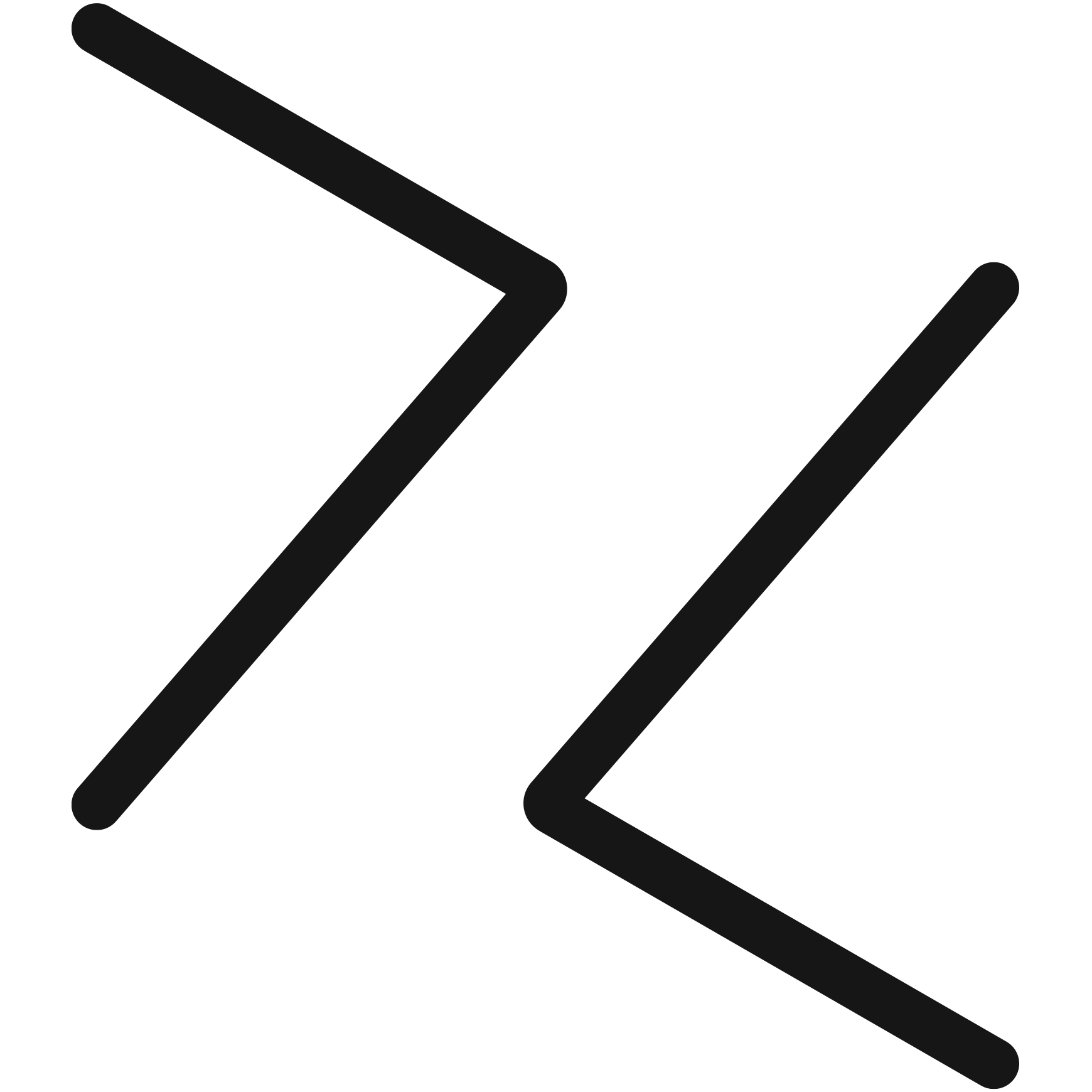
Mentorship sessions
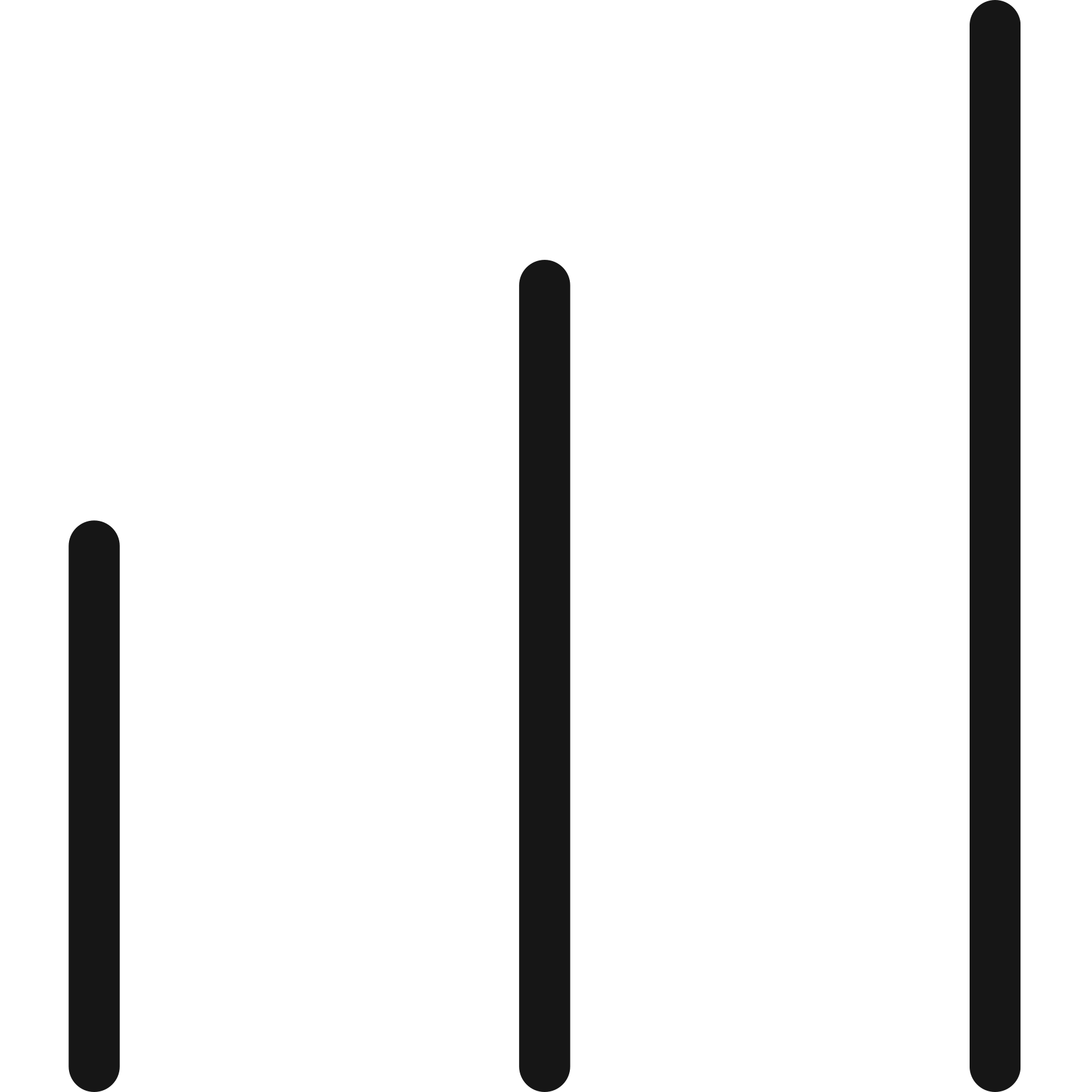
Skills breakouts
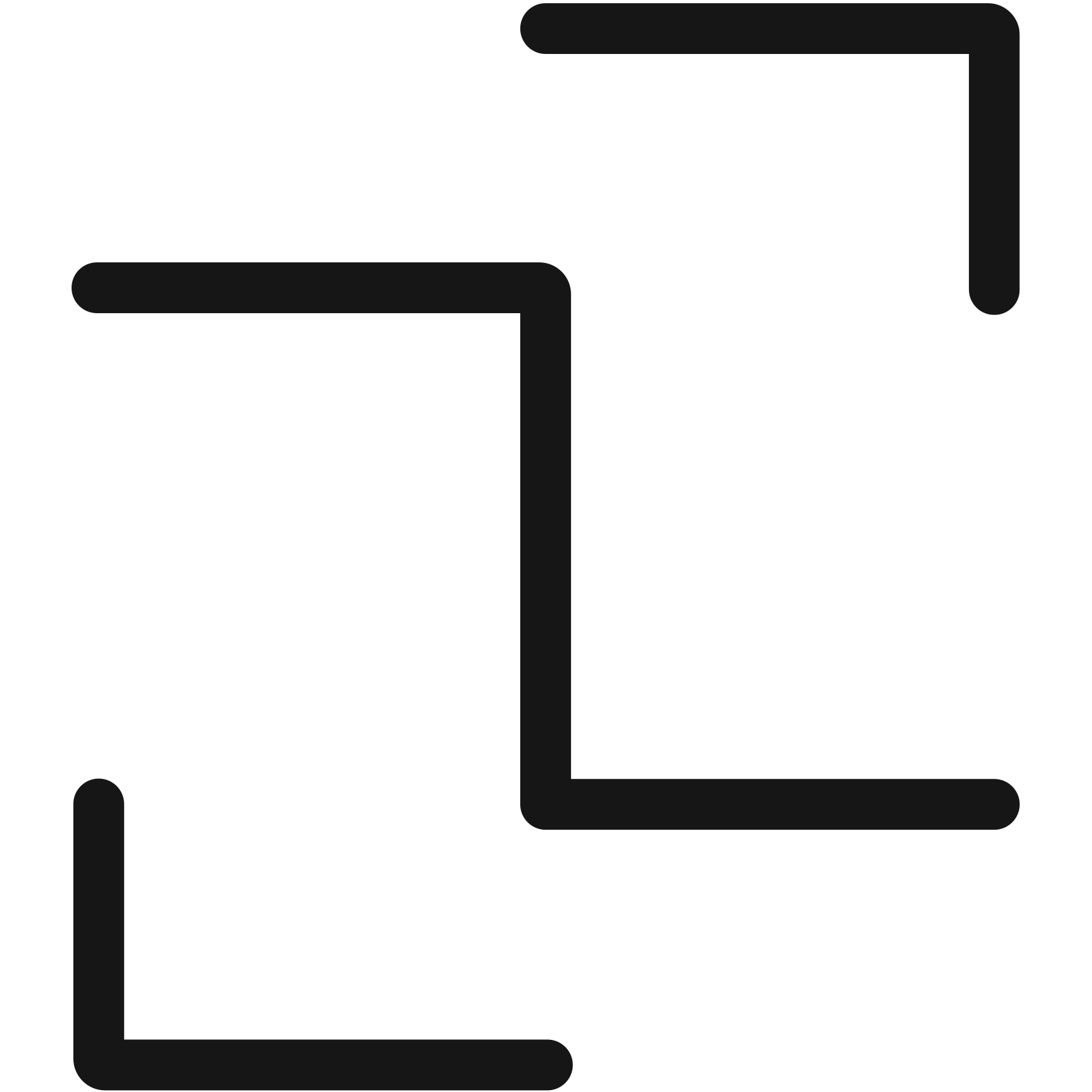
Social activities
05 - Documenting the system
Enabling consistent execution at scale
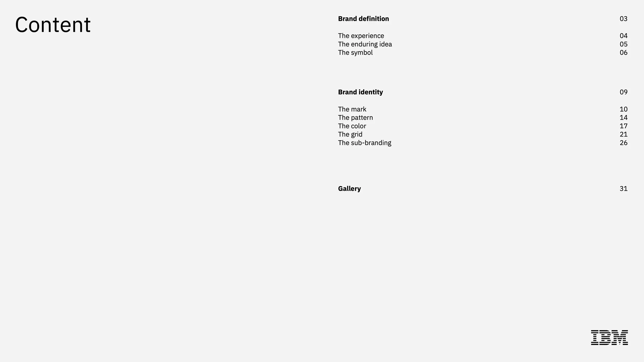
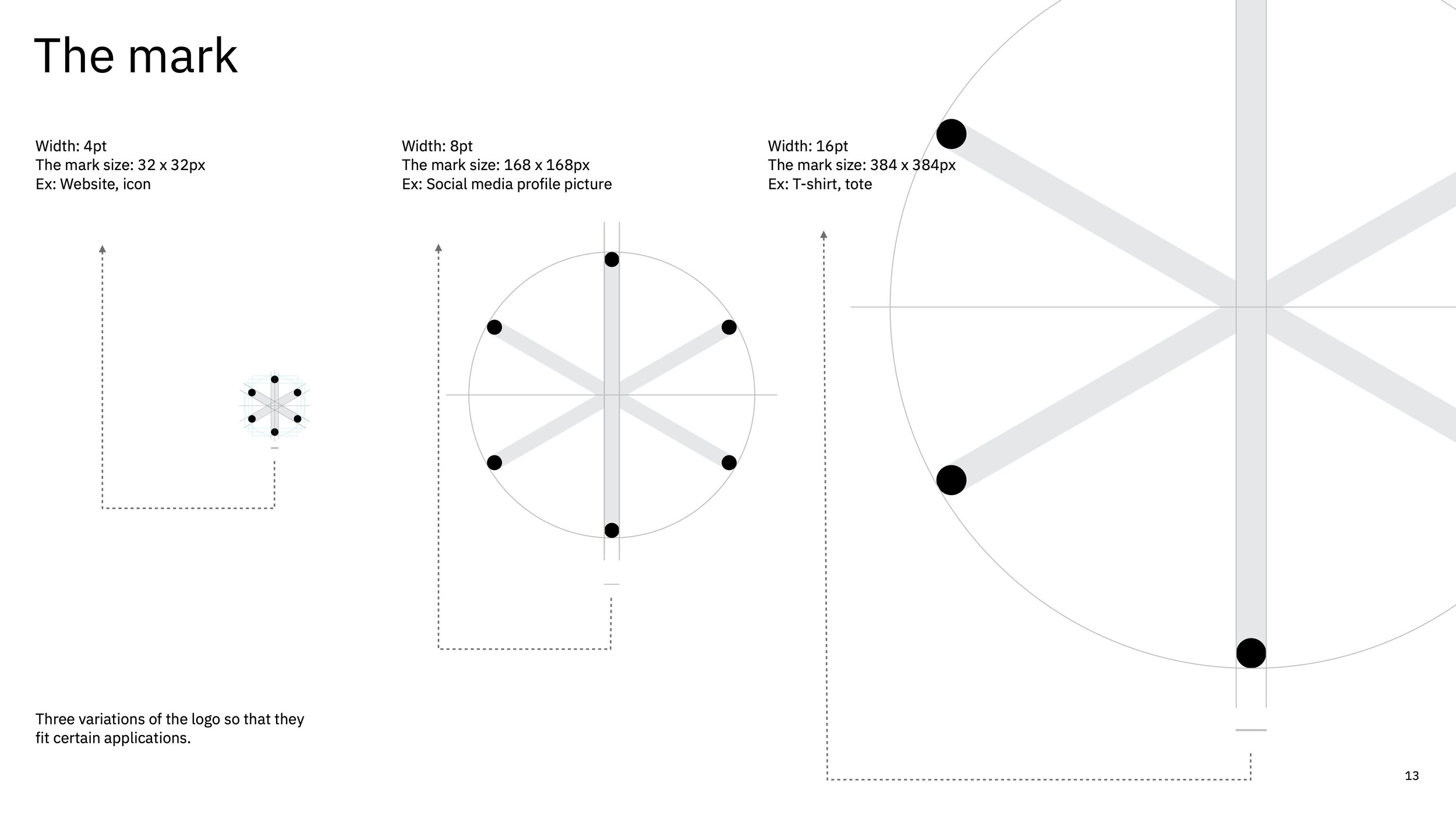
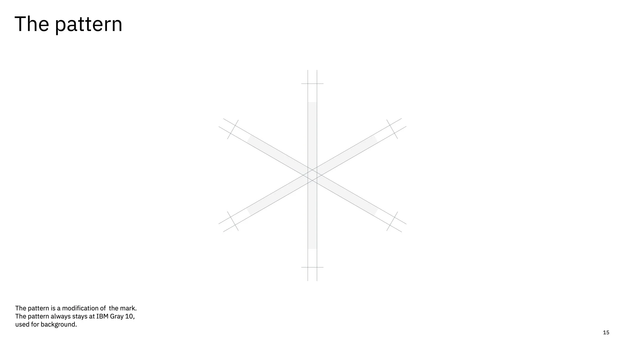
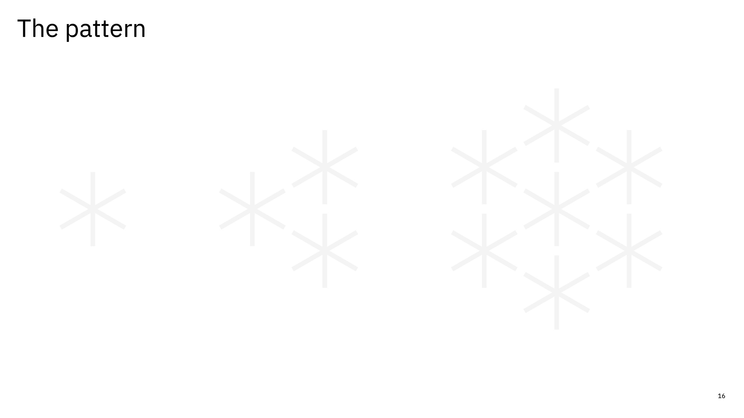
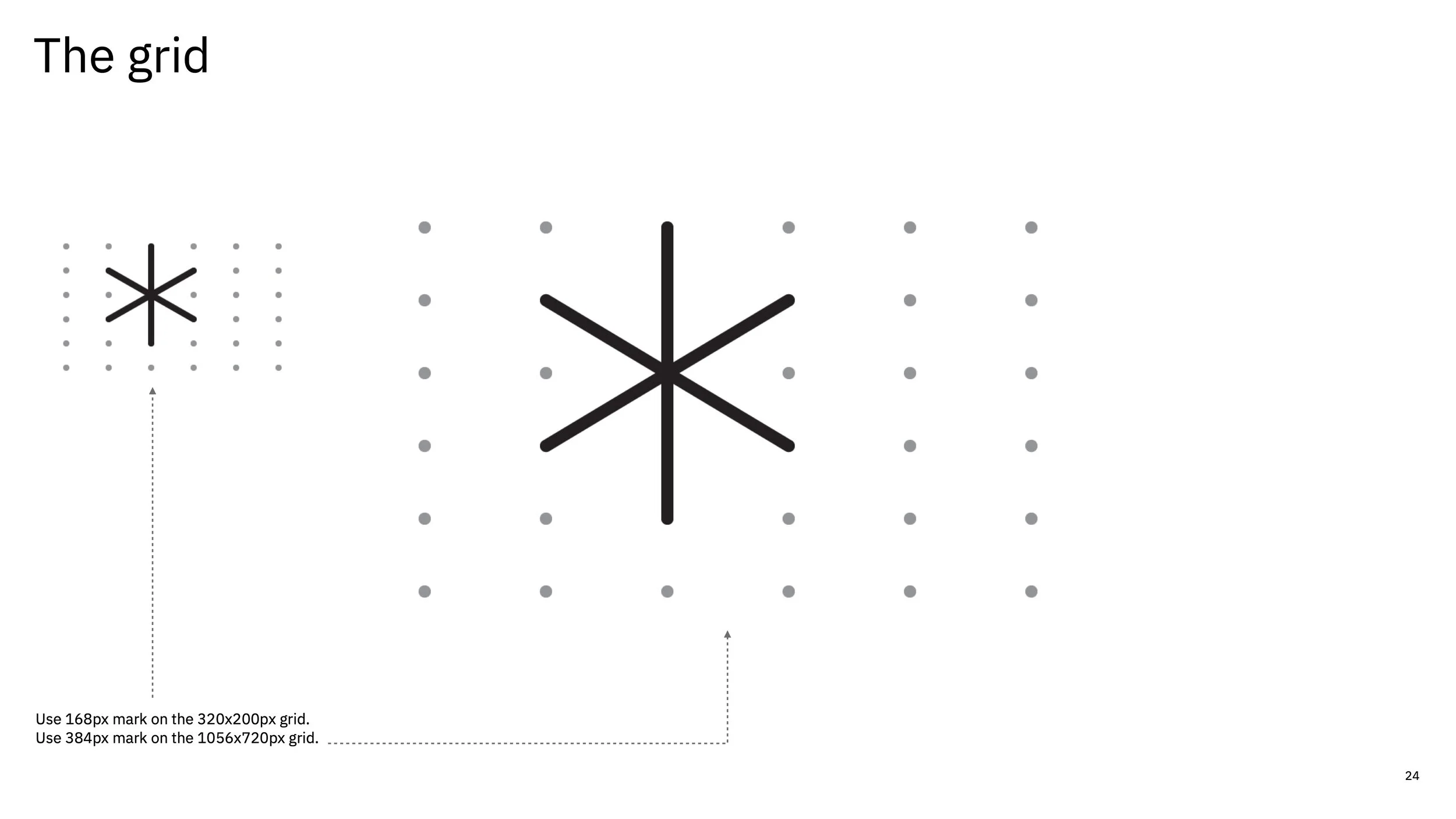
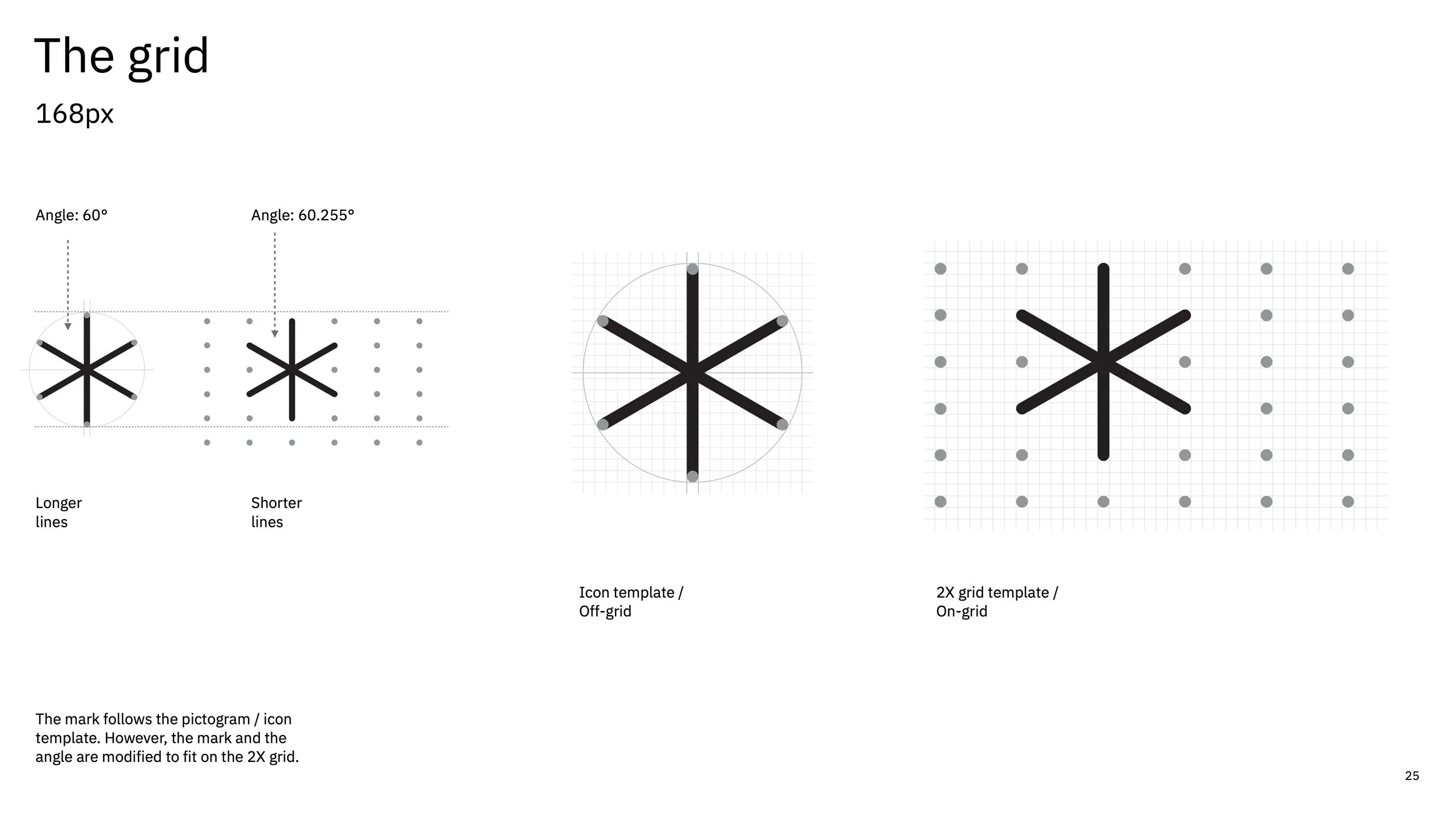
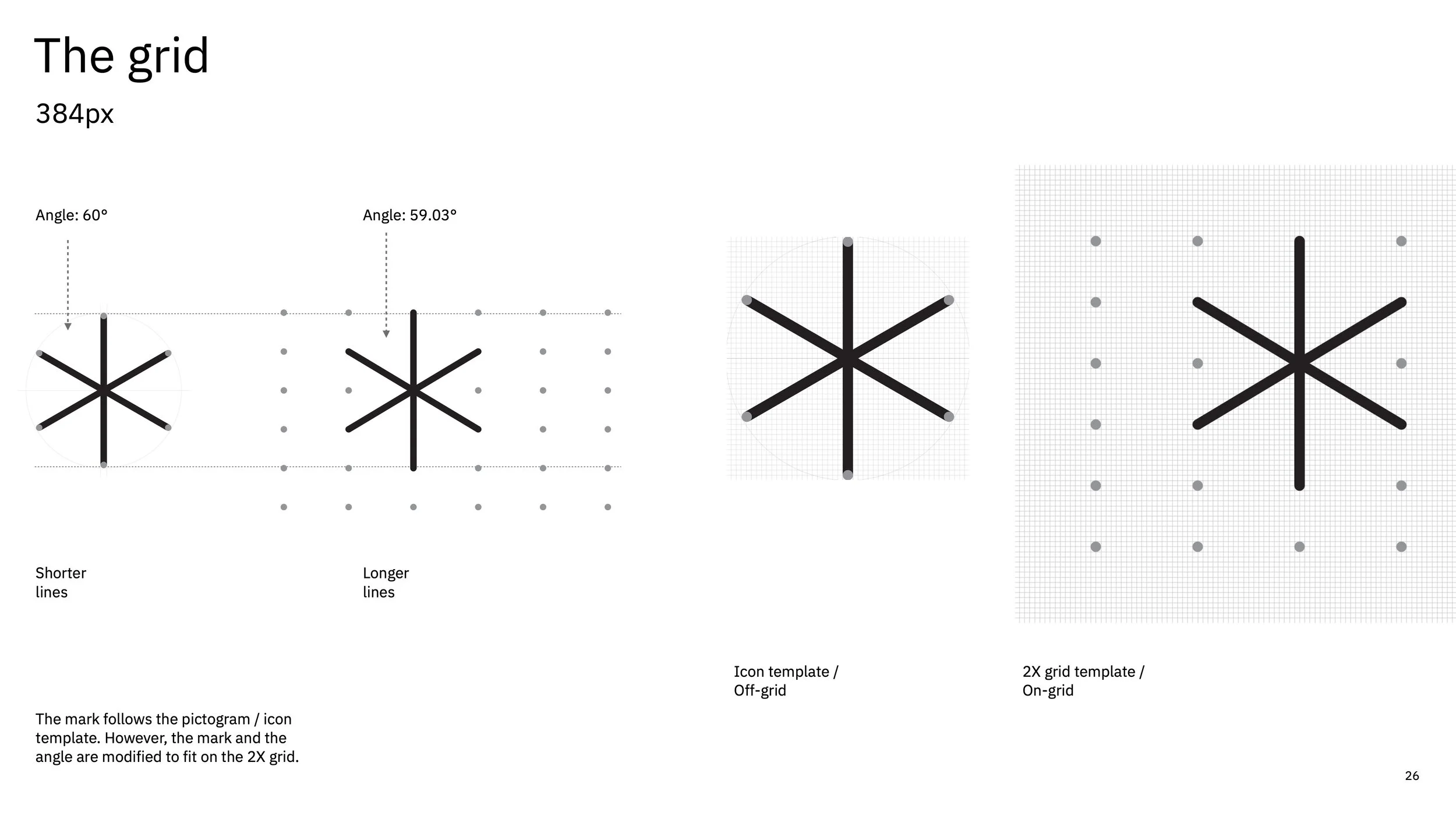
To support implementation across multiple planning committees, we documented the identity in a comprehensive set of brand guidelines. These guidelines established clear standards for logo usage, typography, color, geometric construction, and supporting visual elements. The documentation provided teams with a shared foundation for creating new assets while maintaining consistency across the conference experience.
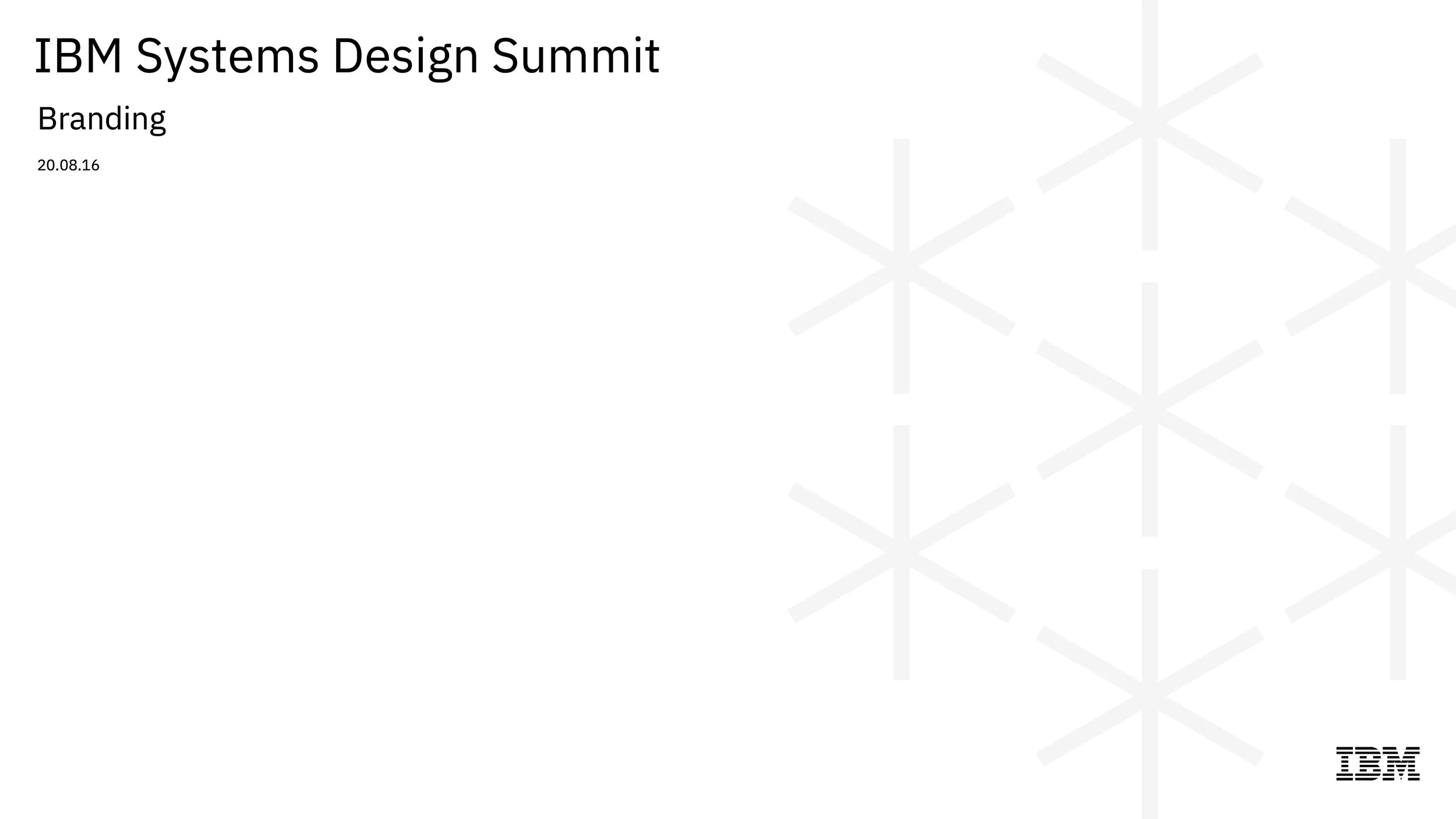
Final Artifacts
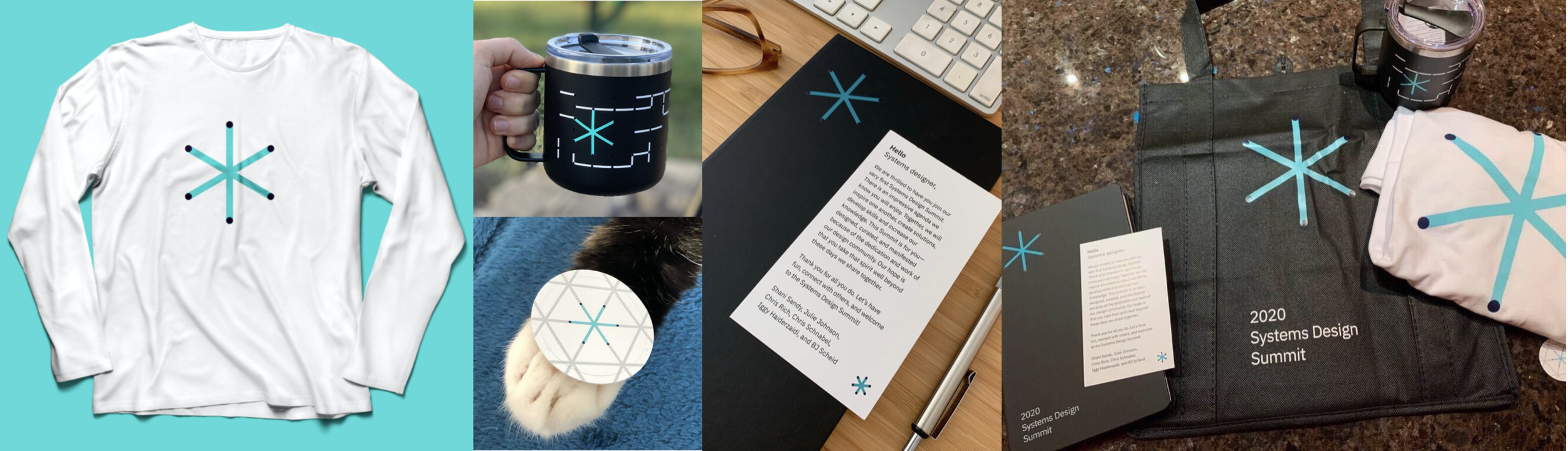
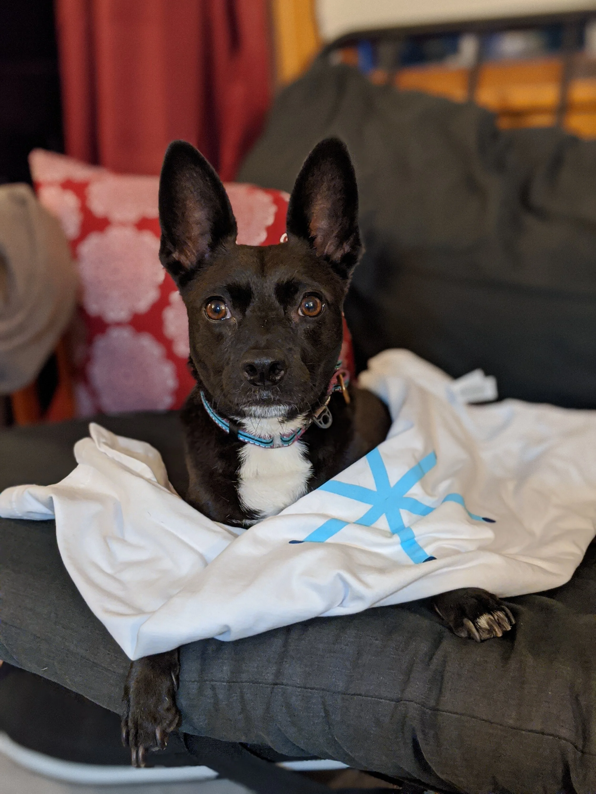
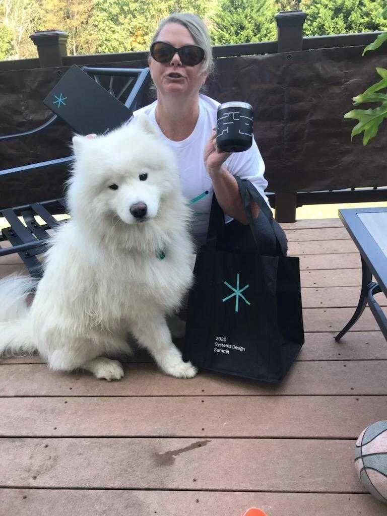
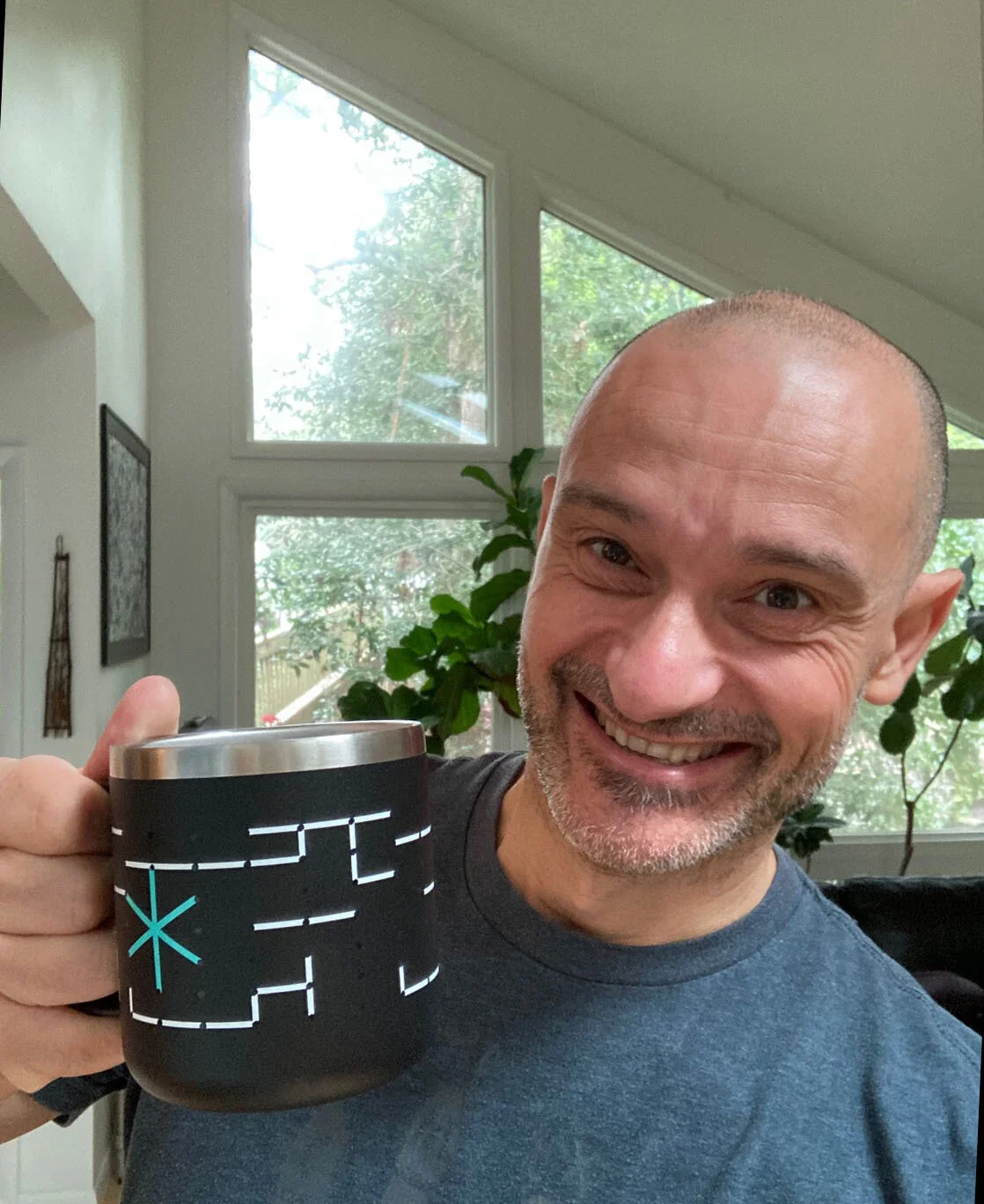
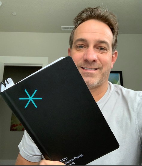
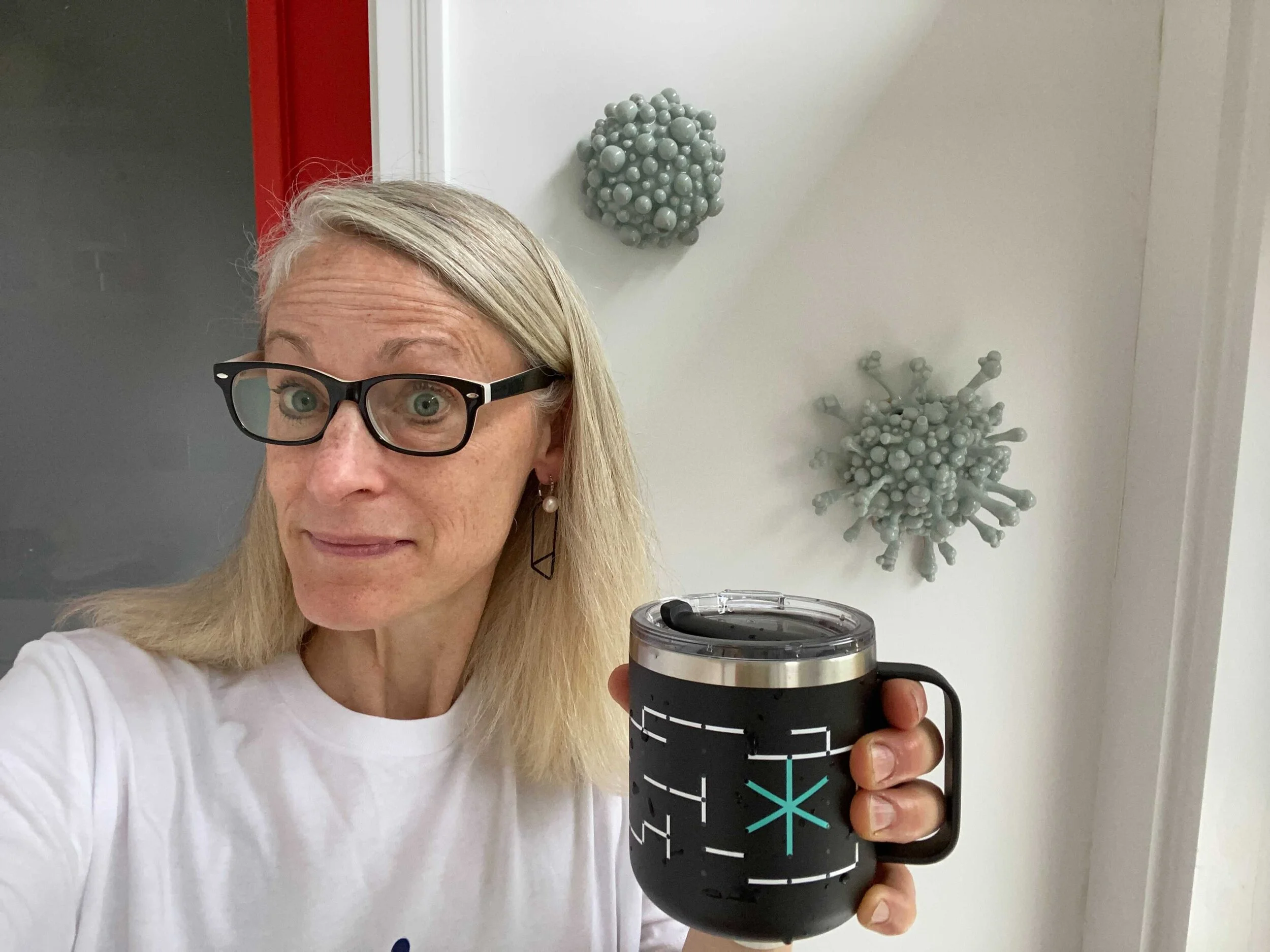
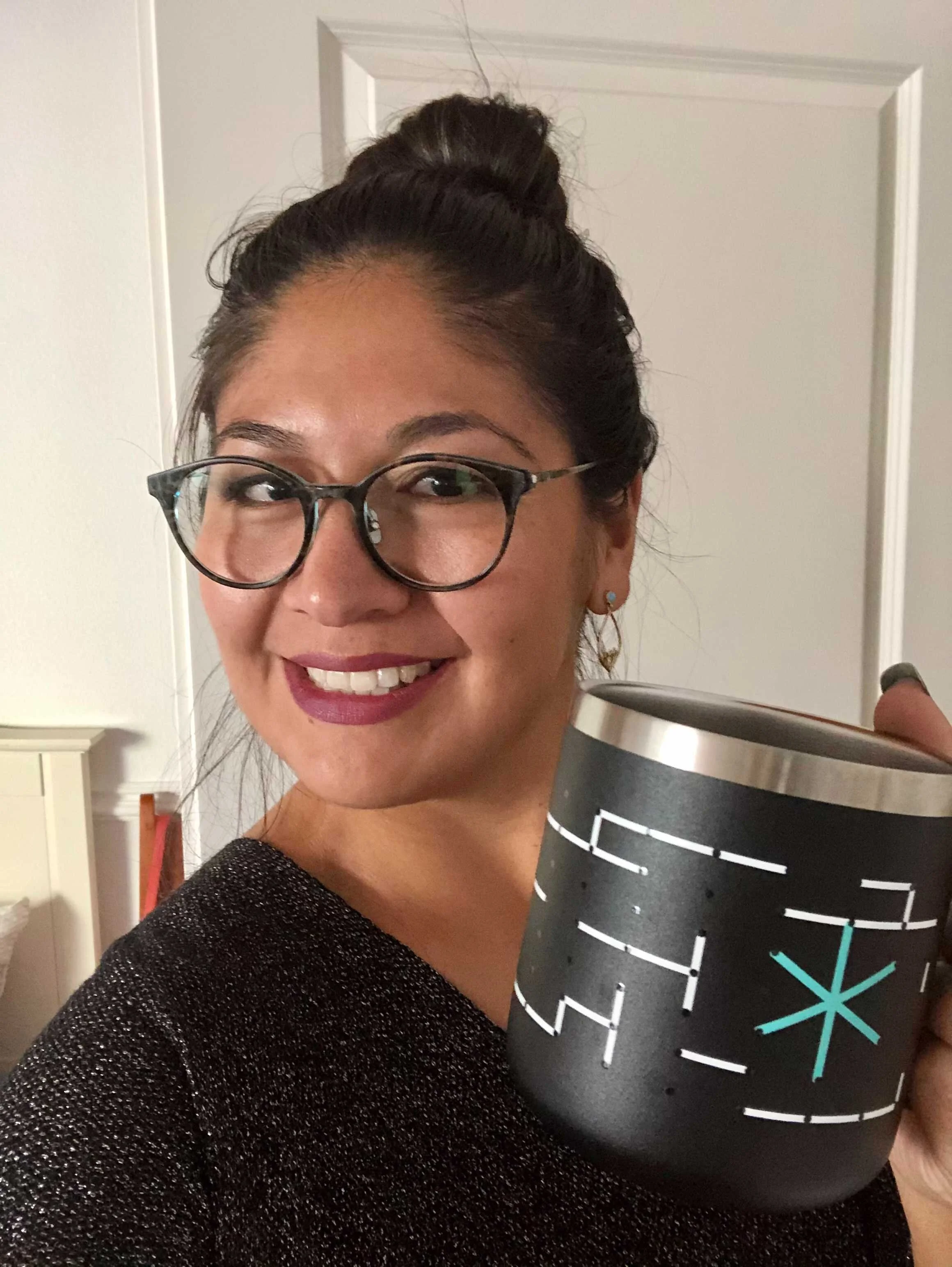
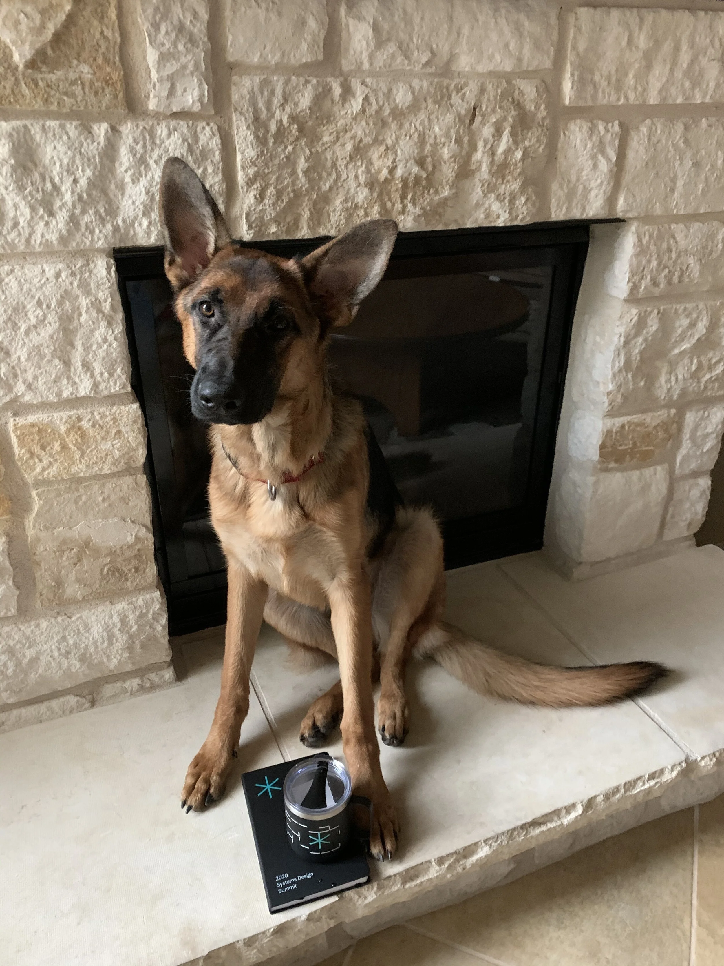
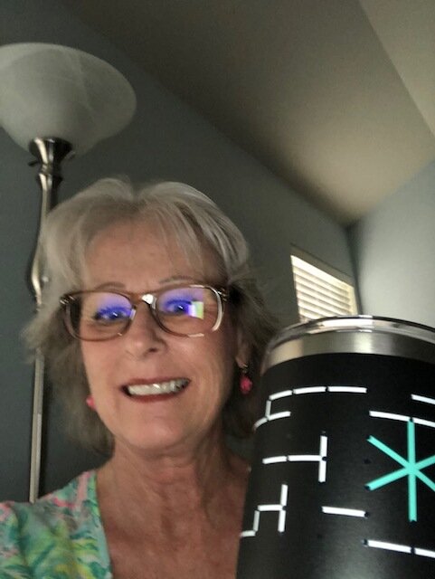
Brand merchandise
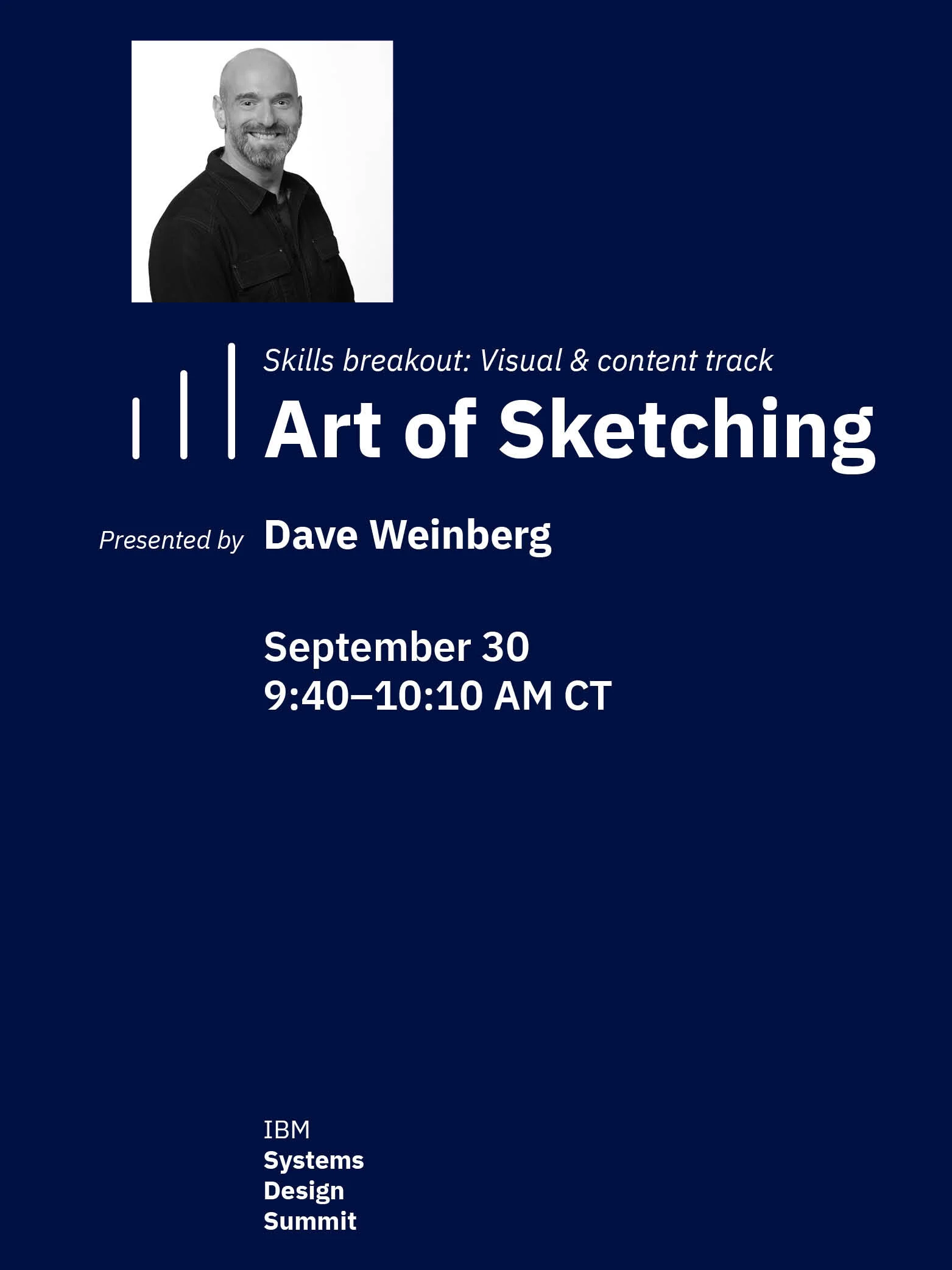
Event posters
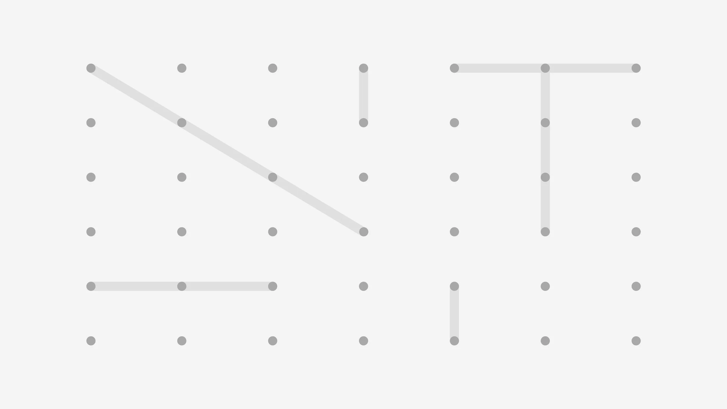
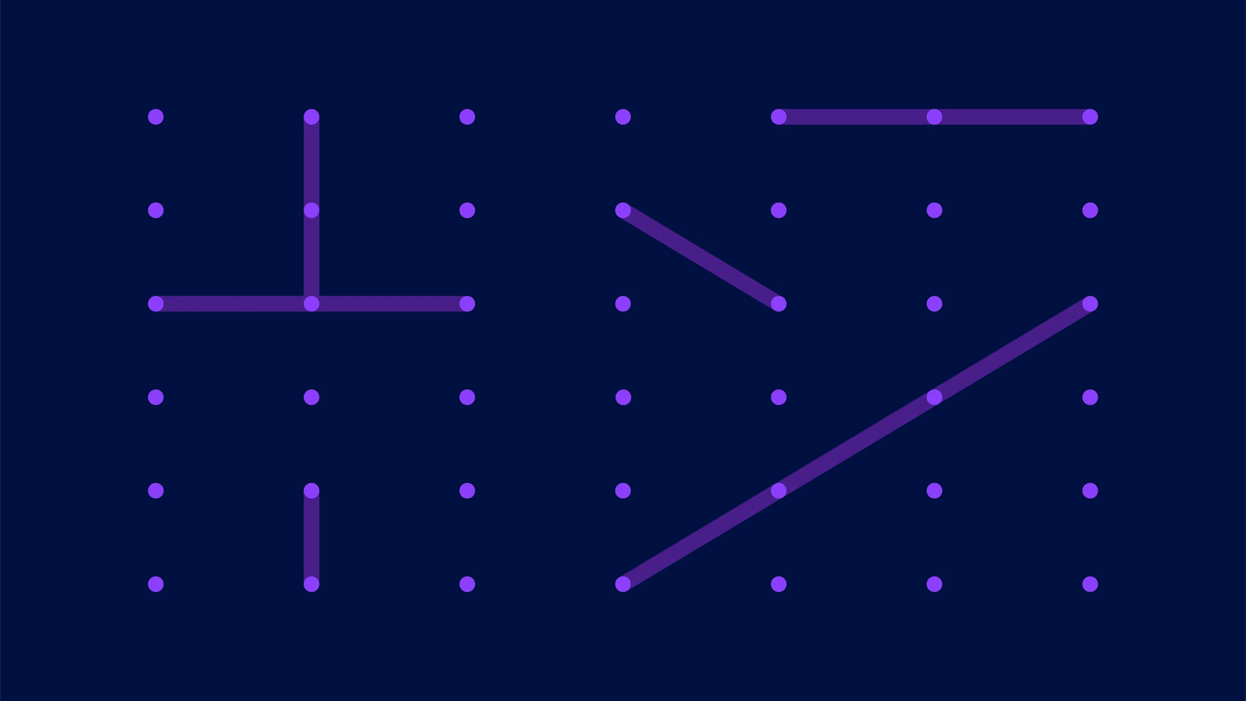
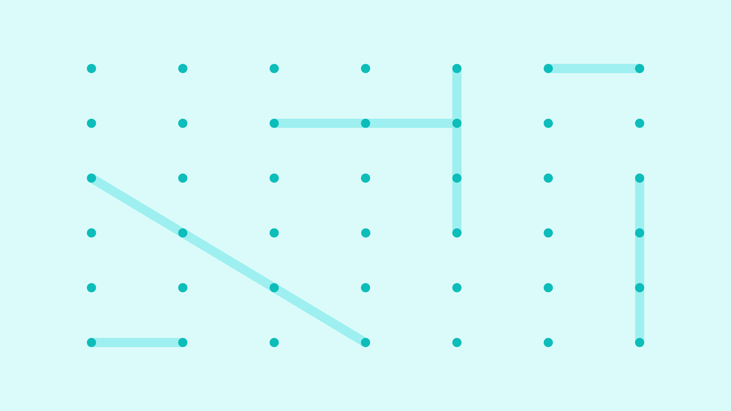
Virtual meeting backgrounds

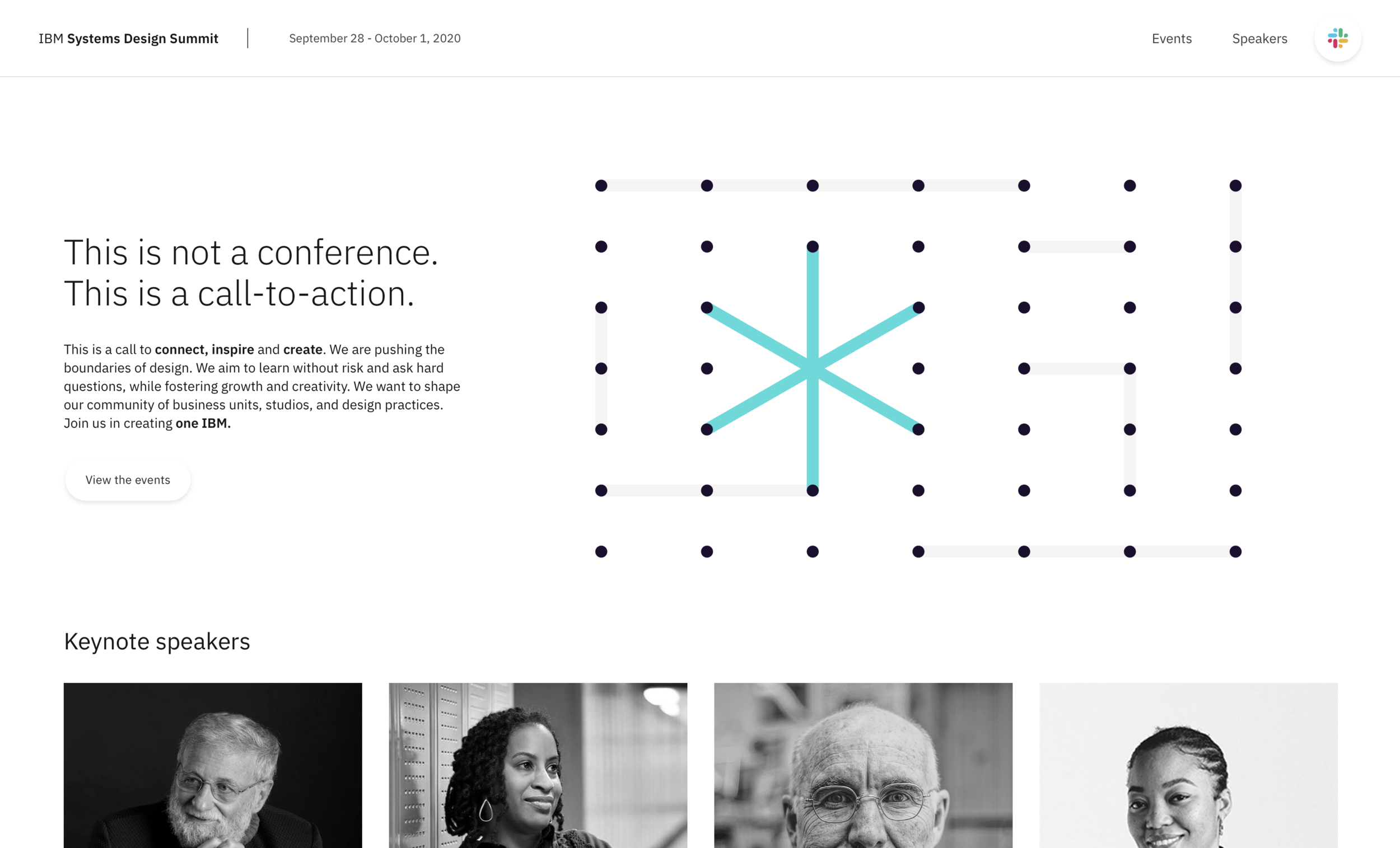
Event website
“I just want to compliment you on your beautiful visual design! WOW! Everything looks so amazing, cohesive, and polished!”