IBM DESIGN LANGUAGE — APPLICATION ICONS
Creating distinctive visual identities for enterprise software through thoughtful, consistent iconography.
Branding, Visual Design, Iconography
Project Background
IBM’s enterprise software portfolio includes a wide range of specialized products, each requiring a distinct visual identity within a unified design language. The objective was to create application icons that communicate each product’s purpose while maintaining consistency with IBM’s established visual standards.
The Approach
My approach focused on understanding each product’s core functionality and translating abstract technical concepts into simple, recognizable visual forms. Through ideation, stakeholder collaboration, and iterative refinement, I explored concepts that balanced visual clarity, product identity, and alignment with IBM’s design language.
1
IBM Z Digital Core
Visualizing connectivity and integration
IBM Z Digital Core helps organizations modernize their core systems and connect existing technology with hybrid cloud environments. The goal was to create an application icon that visually communicates the concepts of connectivity, modularity, and integration
01- The Design Process
Exploring Visual Concepts
I began by understanding the product’s purpose and identifying key themes that could inform its visual identity. Drawing inspiration from concepts of connectivity, modularity, and integration, I explored a range of geometric forms through initial sketches. These explorations were translated into digital concepts, allowing me to evaluate different approaches to representing the product.
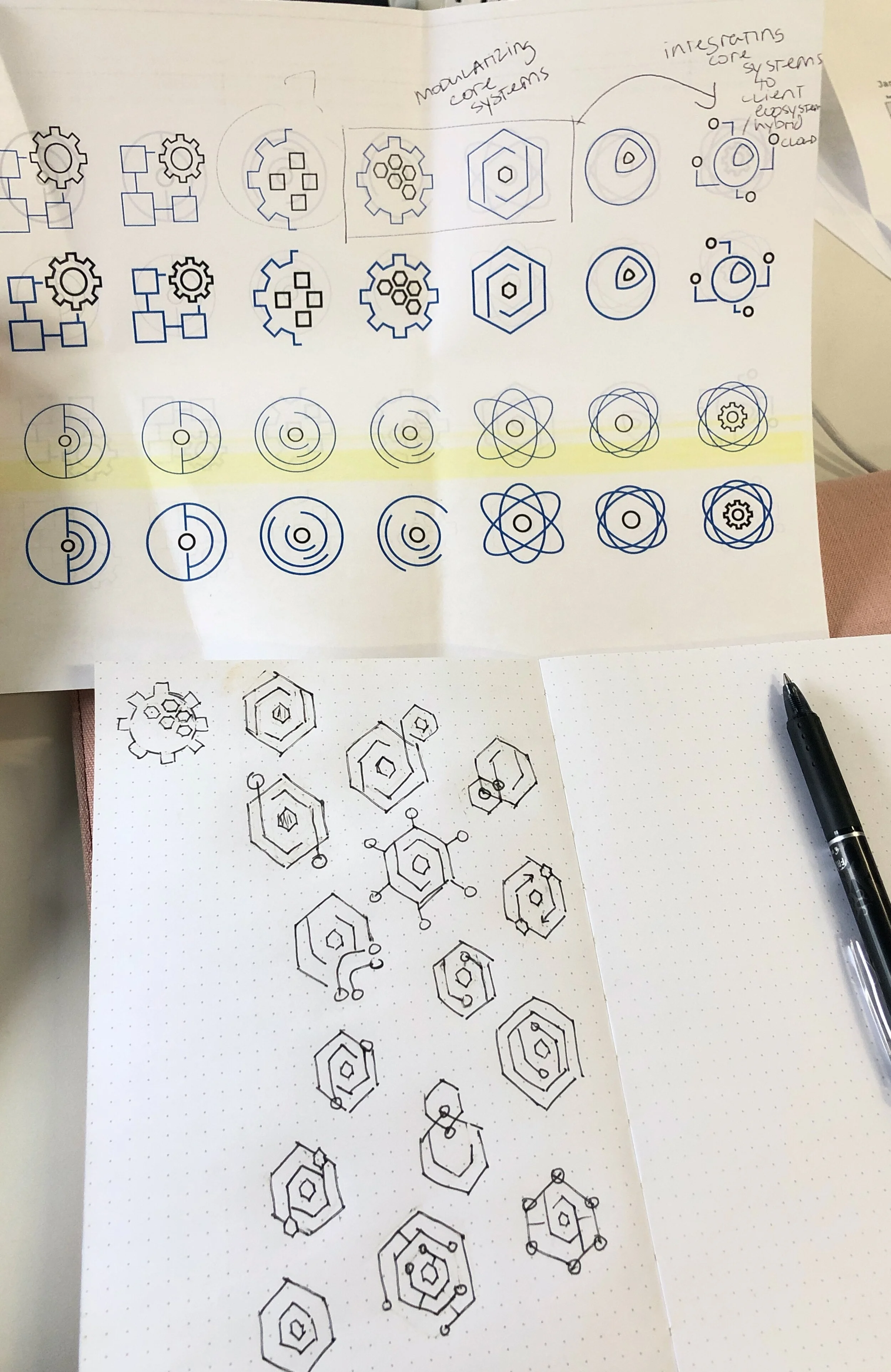
Initial sketches
02 - Iteration & Refinement
Evolving concepts through feedback
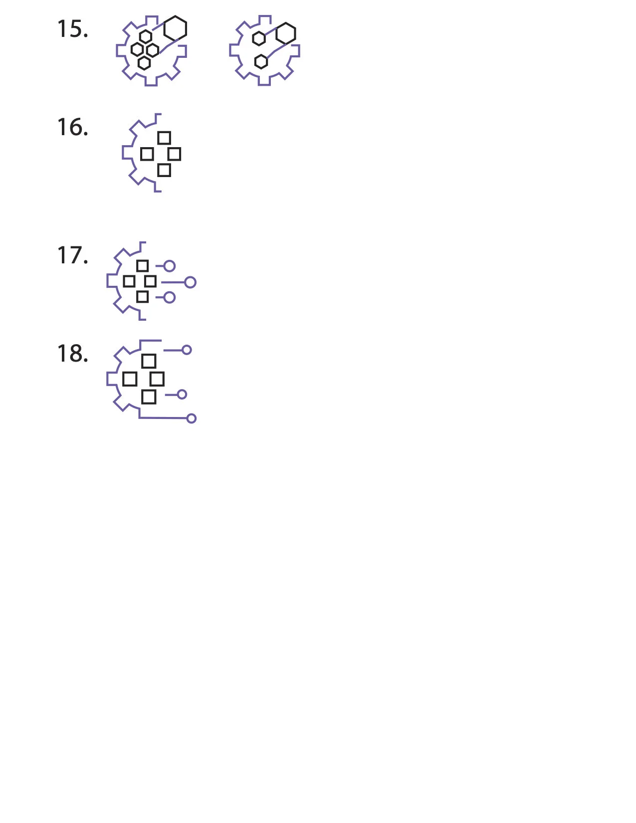
After presenting initial concepts to stakeholders, I incorporated feedback to further explore the idea of integration. I developed additional variations, refining the geometric forms and visual relationships to create a distinctive icon that remained consistent with IBM’s design language.
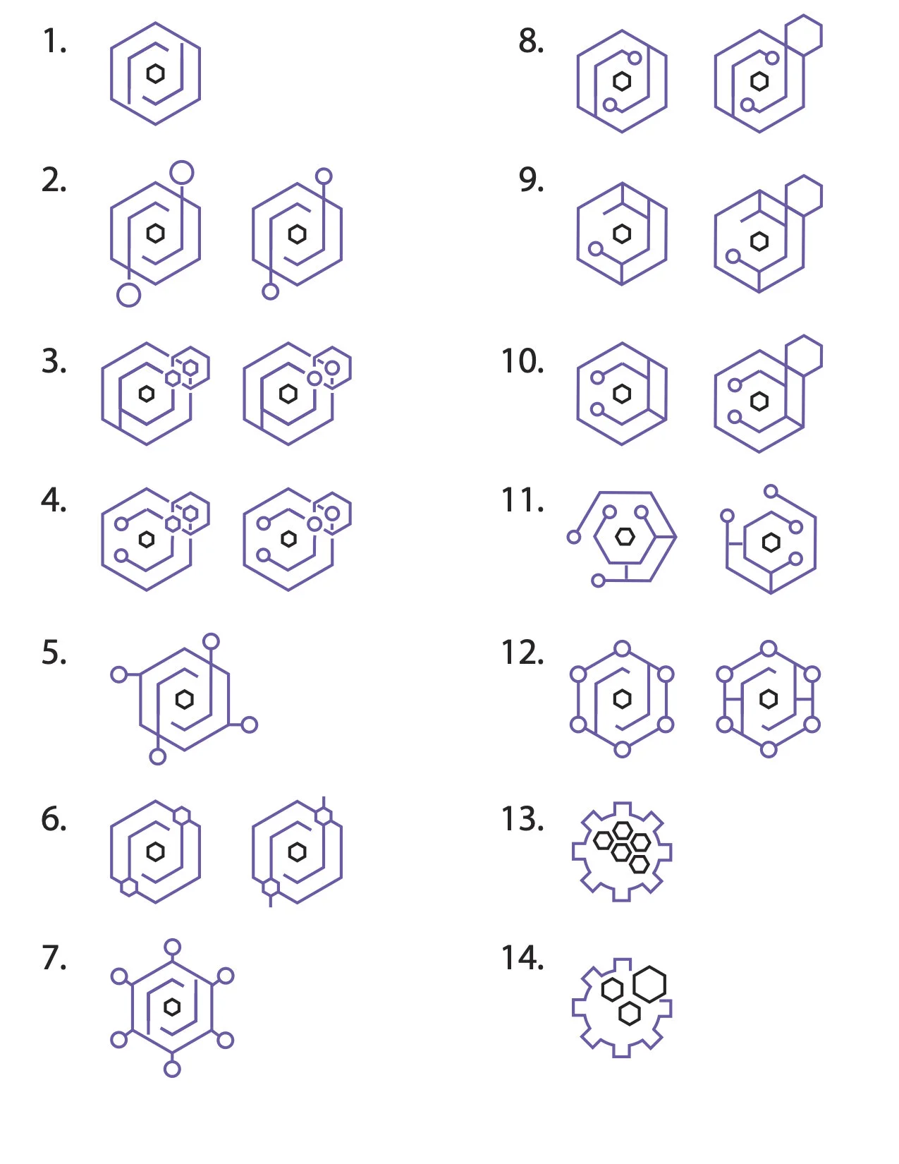
Concept iterations
03 - Final Design
A cohesive visual identity
The selected concept was refined into a final application icon, balancing simplicity, recognizability, and alignment with IBM’s visual standards. The icon was subsequently used across client presentations, webinars, and product launch materials.




“Lexi was PHENOMENAL to work with!
She really listened to what Z Digital Core was about and came up with logos that really captured our mission. I also greatly appreciated the process - we had a discussion, she read through a lot of materials, came up with ideas, was open to requests for changes, and then springboarded from our comments to come up with even better suggestions. ”
“We love it! We are SO VERY VERY VERY grateful for your creativity and thought you put into it!”
“Lexi, As I once again inserted the icon that you created for my Z Digital Core offering, I realized that I never wrote to formally express my respect and gratitude for the work you did! Shame on me for your work is deserving of a formal written thank you.
You read up on and listened to the goals of the offering, and how the icon would be used - and then translated that understanding into a wide range of icons for us to choose from. I very much appreciated how you started from a broad set of icons and then as we narrowed down the options you also increased the level of details provided which made for a very efficient approach. You also then received our feedback to iterate further resulting in an icon that captures the essence of Z digital core. Throughout the whole process you communicated clearly and responded promptly to all questions and requests.
The icon has been used in client proposals, client decks, webinars, as well as most recently in a solution brief to be posted externally. We also intend on using the icon in the launch materials for Artemis wherever possible as the Z Digital Core pattern called Z Digital Integration Hub is included in the hybrid cloud hills.
Thanks again for all your work, passion, and creativity you put into the Digital Core icon — all came through in the process as well as the results. ”
2
IBM IZODA
Representing data through simplified visual forms
IBM IzODA brings together technologies that enable organizations to analyze and visualize large volumes of enterprise data. I designed an application icon inspired by the product’s core concepts of data flow, processing, and interconnected technologies. Using simplified geometric elements, I developed a visual identity that communicates the product’s functionality while maintaining consistency with IBM’s design language.




3 IBM MACHINE LEARNING FOR IBM Z/OS
Visualizing intelligence and connectivity
Machine Learning for IBM z/OS enables organizations to develop, deploy, and manage machine learning models within their mainframe environment. I designed an application icon that represents the intersection of machine learning, data processing, and enterprise technology. The final concept incorporates interconnected pathways and geometric forms to communicate data flow and connectivity while maintaining consistency with IBM’s established design language.